Final Major Project

My chosen theme is ‘in this year’. In the mind map below I explored all the things that could contribute to a year being memorable:

FMP mind map 1

Research table pic

Pitch


This slideshow requires JavaScript.

Proposal

project-proposal-pic-21


Audience Analysis

I consider my audience the general public, but I can divide them into two categories: those who lived through & remember 1989 and those who are younger and don’t. The older generation will have personal memories of the events and media I will be referencing in my work whereas the younger generation may have heard of particularly notable events or iconic media but have little personal connection & be less knowledgeable about them. Other than that, my audience includes all genders, ethnicity, sexual orientations, etc.

How much someone knows about each event depends on the person, whether someone from the older generation may not have been interested in the news or media of the time & someone younger could be more involved in modern news & media to learn about the past. I will try to combat this by making my message clear & use iconic images that have widespread recognition among the public. I will also make use of type in my work, especially if the event in question is lesser known in order to give my audience clues.

I belong to the category of people who did not live through 1989, so my connection to the events is less personal but I have personal connection to some of the media released in that year and I have an interest in history, so I likely know more about this year than the average member of my generation & I plan to become more knowledgeable as the project goes on. However, I’m still looking at these events in the past tense and with modern perspective and that may affect the events & media I choose to display in my work (e.g if a movie was a hit in 1989 but has since lost interest I may not include it despite its relevance at the time).

I will likely end up focusing on western media and news big enough to reach the West but try to include news stories from around the world, possibly have no more than 1 story per country to ensure a wide radius of sources. This is in effort to stay unbiased but considering it is the British public that will likely see my work I will make sure the stories could be somewhat familiar to the older generation and (if not) understandable for the younger generation.

I will adjust my work to focus on specific aspects of these events & media, using visual & typographic clues so that my audience won’t require extensive knowledge of 1989 to be able to recognise or understand what I am portraying in my work.

There is a possibility that members of my audience may have personal connections (and therefore be emotionally invested) with the events displayed in my work and so I will ensure that I portray them in a respectful way and keep to fact rather than rumour.

Research

In The News

Fall of the Berlin Wall

berlinwallfall-tl

From August 13th 1961 to November 9th 1989 a 43 kilometre long, 3.6 metre tall border was build, physically dividing Berlin into East and West.

In the aftermath of WWII, after the fall of the Nazi party and Germany’s defeat at the hands of the Allied forces (British, French & Americans) and the Soviet Union, Germany was divided and occupied by each country (what was previously believed to be temporary), all of which had different ideas for post-war Europe, most prominently between the Soviet’s Communism and the Allies’ Liberal freedom.

The Federal Republic of Germany in the West & the German Democratic Republic in the East.

Around the world the wall became known as ‘The Iron Curtain’. The wall had 3 checkpoints Alpha, Bravo and Charlie, Charlie being most famous due to an incident where Allied & Soviet tanks had a standoff on either side of the wall until the leaders of both parties came to an agreement and both sides of the potential conflict backed off.

By 1961 20% of  East Germans had defected West, so in order to prevent any more losses the border was officially closed. There were 302 watchtowers & 20 bunkers, barbed wire, guard dogs, mine fields, etc. on the East side in an effort to keep their citizens inside. 136 people died in unsuccessful attempts to cross the Berlin Wall but a farther 5000 managed to escape despite the extensive precautions taken to prevent this. They accomplished this in many ways, by either defecting while abroad, digging, swimming, or even flying across or, most notably, by crashing a stolen tank through the wall itself.

On November 9th 1989 it was announced that all checkpoints would be opened and the East Berliners were free to leave. The crowds of people who gathered took it as a sign the wall was no longer needed and began to demolish it, thus reunifying Berlin.

berlin-wall.jpg

Berlin trip

In upper school I took German as a subject and our teacher did a yearly trip to Berlin. I only attended for the second year, not feeling up to it the first chance I had. In retrospect I wish I had gone both times because I remember enjoying myself and the new environment. One of the main activities they had us do was a tour of some of Berlin’s landmarks such as check-point Charlie and the remains of what was the infamous Berlin Wall. At the time I knew little about the cold war or why exactly they felt a wall was needed but it still struck me that one city could be so literally divided. Another thing I noticed was the layers of graffiti that covered the still-standing pieces (some pieces clearly more recent than others) and it surprised me that people would be allowed to do that. Again, only years later after some research do I realise that it would have only been on the Western side of the wall as the East Berliners were under the scrutinising eye of the Stasi, likely much more fearful of the punishment for vandalism than those in the West. I wish I’d been taught more about these events prior to my trip so I could appreciate them more at the time.

I will definitely be referencing this event in my final pieces.

The Registered Partnership law

LGBT_flag_map_of_Denmark.svg

The Registered Partnership law is passed in Denmark which grants same sex couples many of the rights and responsibilities of marriage, being the first country to grant legal recognition to same-sex unions.

Same sex marriage was officially/fully legalised in Denmark in 2012, but it was the first country to give them rights and recognition as legal partners in 1989. The first country to legalise gay marriage was the Netherlands on April 1st 2001; England, Wales and Scotland didn’t legalise it until 2014, with Ireland and the U.S.A (who previously only legalised/illegalised it a state at a time, first of which being Massachusetts in 2004) following the year after (2015), 10 years after Canada.

As a supporter of the LGBT+ community this is an important moment in history in regards to same-sex rights & recognition and it surprises me that not many other people seem to know about this point in LGBT history. Considering how much LGBT rights have been in the news over the past few years it’s possible the current public will be interested in this event, meaning I will likely use this in one of my final pieces.

Tank man

Tank Man.jpg

Tank Man is an alias given to an unknown protester who stood directly in front of a line of 4 tanks the day after the Tiananmen Square protests of 1989 (AKA the June Fourth Incident), which were forcefully ended by the Chinese military. The demonstration was an attempt by Chinese students to end of corruption within the Communist Party, democratic reforms, freedom in the press and of speech.

I and many other find this image compelling due to the sheer bravery of the unknown man and the act of defiance this picture captures in the face of something more powerful and terrifying than ourselves.

I’ll definitely try to incorporate this image into my final piece, seeing as it’s just as impactful now as it was almost 30 years ago and almost everyone I’ve asked (regardless of age) recognises the picture.

Tank-man-different-view-pinterest

Another photo of this event I found is above, taken from ground level giving viewers an idea of what it may have been like to be present as it happened.

Hillsborough disaster

On the 15th of April 1989, during a match between Liverpool and Nottingham Forest there was an overcrowding problem when police filtered spectators through to a single gate, exit gate C, and into an already full central pen. The incident resulting in the death of 96 people and 766 injuries and has been referred to as “the worst disaster in British sporting history.”

There has been more recent news about this incident as in June 2017 six individuals were charged with gross negligence manslaughter, perverting the course of justice, and misconduct in public office whereas previously the incident was blamed on the Liverpool fans themselves and it was recorded as accidental death as opposed to to being unlawfully killed. This has brought the case back into the public eye and to my attention.

However due to those recent news stories I know there may be members of my audience who have an emotional connection to the event and would not appreciate it being portrayed in my work so I’ll have to consider that going forward.

Margaret Thatcher 10 years as Prime Minister

Thatcher 89.jpg

Opinions on Margret Thatcher are very much divided, even now. For me, someone who didn’t live through her time in office, I only really knew her as the first female Prime Minister- that alone would be progressive for the time seeing as we’re only seeing a second female Prime Minister decades later.

Margaret Hilda Thatcher (October 1925 – April 2013) was the first female Prime minister of England, she was in office from 1959 to 1992 and was dubbed The Iron Lady.

When asked about Thatcher opinions are divided but I grasp that a majority of the public do not think kindly of her so I am less likely to bring her up in my final pieces.


Other stories: One of the deadliest tornadoes in modern times strikes Saturia, Bangladesh Tornado killing as many as 1,300, The Galileo Spacecraft is launched by NASA on October 18th, Sky TV Launched In UK, The Baltic Way peaceful protest is held on August 23rd, In Egypt, a 4,400-year-old mummy is found in the Great Pyramid of Giza, The Dalai Lama won the Nobel Peace Prize

Technology: First release of Microsoft Office, Nintendo begin selling the Game Boy & 100 year anniversary and the invention of the world wide web.

I’ve concluded from my research into 1989 news that it was a year of defiance & control.


In The Cinema

Batman 

Batman 89

Directed by Tim Burton, starring Jack Nicholson and Michael Keaton, this movie was the first of a series of Batman movies, albeit one with a darker tone then the Adam west show and films (however that is to be expected considering the new director and the style he has since become unmistakably associated with).

The movie is about Bruce Wayne’s early crime-fighting career as Batman in Gotham City, the creation of The Joker from a criminal to a villain and their first encounter as rivals.

Tim Burton is one of my favourite directors and Batman is one of the most popular fictional characters of all time, so seeing his story told through this lens is amazing.

The Little Mermaid

the-little-mermaid-posterDirected by Ron Clements & John Musker with music composed by Alan Menken & Howard Ashman this movie has become is known as part of a period of time dubbed the ‘Disney Renaissance’, when Disney was releasing some of their most iconic and successful films after a period where Disney, as a company, were struggling to compete with other companies.

The film  is about Ariel, the youngest Princess of an underwater kingdom who makes a deal with a sea witch, trading her voice for a pair of legs, to get to the surface and try and get a human Prince to fall in love with her.

I remember this movie very fondly from my childhood and still occasionally listen to the award winning soundtrack. The animation was also quite impressive for it’s time and my favourite sequence in the film is the villain song ‘Poor Unfortunate Souls’ as it’s both my favourite song from the soundtrack but the animation and direction of it are quite impressive.

Look who’s talking

look_whos_talking

“After a single, career-minded woman is left on her own to give birth to the child of a married man, she finds a new romantic chance in a cab driver. Meanwhile, the point-of-view of the newborn boy is narrated through voice-over.”

I remember this movie from my childhood and it’s one of the films I associate with watching with my family, particularly my mother. We both found the film funny but it’s been a while since I’ve seen it so I struggle to recall exact scenes.

Dead Poets Society

Dead Poets Society poster

I watched this film for the first time after starting this project, but previously had heard good things about it, though I knew little about the plot other than Robin Williams playing a teacher.

“English teacher John Keating inspires his students to look at poetry with a different perspective of authentic knowledge and feelings.”

See no evil hear no evil

See-No-Evil,-Hear-No-Evil-1989-movie-poster.jpg

“Dave is deaf, and Wally is blind. They witness a murder, but it was Dave who was looking at her, and Wally who was listening.”

Starring Richard Pryor and Gene Wilder, I only remember the first half of the film but from what I saw it was funny.

Heathers

heathers-89-poster.png“Veronica (Winona Ryder) is part of the most popular clique at her high school, but she disapproves of the other girls’ cruel behavior. When Veronica and her new boyfriend, J.D. (Christian Slater), confront clique leader Heather Chandler (Kim Walker) and accidentally poison her, they make it appear a suicide. Soon Veronica realizes that J.D. is intentionally killing students he does not like. She races to stop J.D. while also clashing with the clique’s new leader, Heather Duke (Shannen Doherty).”

Heathers_The_Musical_Off-Broadway_Poster

A popular musical adaptation was written and composed by Laurence O’Keefe & Kevin Murphy and first performed on stage in September 2010. While I’ve never seen the performance I’ve listened and enjoyed the soundtrack online.

Kiki’s Delivery Service

Kikis delivery service posterMajo no takkyûbin, translated to English as Kiki’s Delivery Service was directed by Hayao Miyazaki, who also wrote the screenplay based on the novel by Eiko Kadono.

“A young witch, on her mandatory year of independent life, finds fitting into a new community difficult while she supports herself by running an air courier service.”

I really enjoyed this movie for many reasons: the art style/animation was beautiful, the main character is relatable and likeable and the plot line is simple and easy to follow.


Through my research I realise there are a lot of memorable photographs & images from 1989 that may be recognizable to those from that era and could leave an impression on those who didn’t.

Some other films that I am less familiar with but have heard of are Turner and Hooch, My Left Foot, Say Something, Uncle Buck, Weekend at Bernie’s, When Harry Met Sally- I may include some images from iconic scenes I’ve seen or heard of through other media that may be familiar to others.

Contextual Research

I found two newspapers from  1989, below are the pages I found to be of potential use.

filename-9filename-2

I mostly stuck to the pages in which there were photographs or headlines I could sample, illustrate or use to inspired pieces of my collages. The two papers where from November 11th and , the November one being much thinner but better preferred as it had more useful imagery and was more recent to the fall of the Berlin Wall.

Collage Research

Peter Blake

Sir Peter Thomas Blake was an English Pop artist born in 1935 and is best known for his work on two iconic music covers: The Beatles ‘Sgt. Pepper’s Lonely Hearts Club Band‘ album sleeve

His art is vibrant and surreal

Alexander Rodchenko

Alexander Rodchenko was a Russian artist who lived between 1891-1956, and has come to be best remembered for his politically motivated collages. He was a supporter of the Russian Revolution and has been credited as a pioneer of Constructivism alongside Vladimir Tatlin.

What I like about his work is that if you are aware of the political circumstances surrounding Rodchenko in the 1910’s and 20’s then you can likely see what he was trying to communicate whereas if you aren’t as informed about the times you can come to your own conclusions.

The mixture of black and white photos, colours shapes in the background and the occasional use of illustrated images is something I will experiment with and consider carrying over to my final piece.

Gee Vaucher

Gee Vaucher is an Essex based artist, filmmaker, author and anarcho-pacifist born in 1945, notably known for her collages made for the British band Crass and for her Oh America piece used on the front cover of the Daily Mirror the day after the 2016 election.

Her work is often crude and brutally honest and uses them as a way to express her strong anarcho-pacifist opinions on things like society and politics. Some images seem to be intentionally jarring or shocking in order to make a point.

The mostly grimy, monochromatic images used in her collages give off a bleak & blunt feeling, but it also means that is colour is used it stands out al the more (e.g. her 1979 Smile piece used on the front of the International Anthem cover). The proportions of the characters in her work are usually consistent with the background or with the several pieces used to make them.

I will also be using collage images to express political views of 1989, and I will consider the use of colour (or lack there of) to make things stand out. I may also use colour as a way to add age to my piece to make it look more genuine to 1989, perhaps continuing the grunge-like theme of Vaucher’s work.

Experimentation

I was able to get my hands on several editions of Marie Claire magazines and went through them, using a scalpel and cutting mat to extract the images and type I was interested in out.

First I experimented with taking the pieces I took (after they caught my eye or interest) and simply tried creating new images, partially inspired by the sometimes random and jarring look of collage work (Vaucher, Rodchenko).

(Above) More experimentation, sample images and potential inspiration along with annotations.

filename-7filename-8filename-3filename-9

Above is the wide range of type samples I got out of various Marie Claire’s and how I can use them/what they could be referring to in my collage.

filename-1[938]

(Above) Adhesive experimentation: I concluded that PVA glue or double sided tape would be most suitable.

Development

While trying to keep all my available images in mind I tried sketching out potential placements in a collage. I also tried designing it around both rectangular & square canvases.

filename-1[1059]

The variety of designs I did helped me organise what I did & didn’t want my pieces to look like.

filename-1

I then experimented with materials I considered using for the illustration of the collage pieces, trying to find both pros and cons in each of them and how they could be used.

Berlin Wall collage samples:

berlin wall samples

This collage will be simple and contain the most type out of all of them. Above is the images and type authentic to 1989 that I’ll use in it and the collage itself will be drawn out in black ink & possibly black watercolour for large surfaces.

Tank Man collage images:

I think this collage will be my most minimalist since it will only be a single image and about four words of type. Again, this one will be monochrome in colour scheme and due to the complexity of the images (the tanks in particular) I will likely be tracing the image in order for it to look accurate and recognisable since this is a greatly iconic photo.

Recognition collage:

While this is also a ‘news’ collage this one will have the most colour of them since it is necessary for the Denmark & Pride flags to be recognisable. The two 1989 Marie Claire photo’s of same sex couples will be kept black & white to try and tie in to the other ‘news’ collages.

Movie collage:

This collage by far will have the most pieces involved. All the pieces will be coloured best to match the images above using both ink pens and watercolour paint. I’m more nervous about this one due to the number of pieces and hope my plan of how they are arranged will work out and fit each piece in properly- I will try to size each image according to my sketches.


Final pieces

IMG_4744

Evaluation

A majority of my research was done online but I tried to keep my sources credible and went through a number of websites collecting information. As for my primary research I could draw on a past experience relating to one of the main events of 1989, I had people I could ask about the year who remembered it and I searched for authentic resources created/sold in 1989 such as the newspapers and various Marie Claire magazines released that year. I wanted to ensure my work had suitable content, though I admit the pieces I used were due to personal interest and popularity (both before this project and after my research). Through my research I found that 1989 was a year of great change- many of those changes you can still see the effects of today- and that a prominent theme of the year was liberation & freedom (some examples being the fall of the Berlin Wall, various protests taking place around the world and legal recognition for same sex couples for the first time in modern history). My research also expanded my knowledge on events I was already partially aware of and helped me discover new stories & media I could enjoy. I also realise an effective form of research for me is listening to people talk/explain things with visual aids such as the YouTube videos about the events of the year that helped me absorb the information a lot easier than reading long articles. If I were to do it again I would read through the magazines and papers more thoroughly and maybe looked for more authentic pieces of research outside of the internet such a library books or documentaries.

Some of my designs were better than others but I believe a were appropriate for what I wanted to convey. I think all the pieces used in my collages were well made, how I planned their proportions to be and using appropriate colours. I’m particularly proud of my use of shading in Tank Man and Berlin Wall since I only used black ink pens and water to colour them & I wanted more detail on them to better resemble a black & white photograph from the newspapers of the time. If I were to do this again I think I’d like to have been more careful when it came to outlining the piece of my Movie collage as it isn’t a neat as I intended and I feel it effects the visual quality of the piece

Type was only used in three of my final pieces: my Berlin Wall piece and my Tank Man piece primarily while my Same-Sex Recognition piece only had the year ‘1989; and the word ‘recognition’ across the top. In the Berlin Wall I traced the typography samples I took from the Marie Claire’s- choosing the samples I found could relate or be referring to said event and lifting the font straight from the 1989 source. The only other Type used in that piece were headlines about the walls fall, specifically ‘The Iron Curtain Swept Aside’. My Tank Man piece is different in the sense that the type I used was something I came up with and drew up myself. The paradox of ‘what happens when an unstoppable force meets an immovable object?’ definitely predates 1989 and seemed very fitting considering the context of the event and the image of said event I traced and used. The type of font I used for the words ‘unstoppable force’ & ‘immovable object’ was directly inspired by the kind of serifs fonts used in newspaper headlines and seemed appropriate considering the piece was one of my ‘news’ collages and the events definitely made it into papers worldwide. For my Recognition piece I wanted there to be a rainbow of some kind included as a reference to the lgbt+ flag so coloured in ‘1989’ written in bubble-like writing in order for there to be enough room for all the colours, while the word ‘recognition’ was added later to elaborate more on the subject. Next time I’d like to have been neater with the ‘1989’, picked better font to draw out and more delicate lines of colour when filling the numbers in. I made sure to double check my spelling before inking in my words and gluing them to the canvas, while I had little worry with the Berlin Wall piece considering all the words used in it were also in published papers and magazines and were likely spellchecked beforehand. I think all the letters that can be seen in each piece is clear & legible, the exception being the layered type in the Berlin Wall collage as some of the type covers over each other and obscures the words, but this was intentional so I don’t see it as a negative since I believe all the important bits are readable.

I am most proud of my layout of Tank Man & Berlin Wall as they were simple and effective. My Recognition collage seemed a bit crowded for the small space so I’d probably adjust that next time. As for my A3 Movie collage I had planned for a lot more pieces to be in it and for it to be more neatly arranged but due to the absence of those pieces things had to be rearrange. Considering this I think my improvisation was good and I filled the space well so there aren’t huge blank spaces left there, there is something to look at throughout the whole collage. There are definitely things I would change next time but I still think the figures in the piece are recognisable as characters from iconic ‘89 films, so the collage dies its job while still being visually interesting.

As stated in my proposal I wanted to create something clear enough to visually inform a viewer who was not alive or aware during 1989, or simply remind those who were on some events that defined 1989 while also being aesthetically interesting to look at from a creative stand, not just an informative one. For my final designs I either tried to use iconic, well-known images or used visually clues eluding to the events I was referencing, and to this end I think it was effective.

Technique

I originally planned to just print off the original photos & type in appropriate sizes and arrange them on a canvas but I didn’t think it would be visually interesting enough and I wanted to be more creative so I decided to draw the images myself in pencil (possibly tracing a few of them), colour them using various materials (ink & paint) and outline them in black to keep to my personal art style. I chose to do this by hand because I am more comfortable with creating physical art then I am with digital art. The drawn pieces I created I think are quite good, again my two favourites being Berlin Wall and Tank Man being I arrived to make them realistic (due to them being based on real life news stories) whereas my Movie collage could be more cartoonish considering the content. For the Recognition collage the images of the two couples where printed out and painted/inked over to tie them in with my other ‘news’ collages, the rest of the colour used in that collage was necessary to indicate the country being referenced and the pride flag. I both hand drew and traced pieces of art and for some pieces I used a mix of both ink colour and watercolour paint, for the two exclusively monochromatic News collages I traced the images and used ink to colour them but to create the grey in the background of the canvases I used watercolour and to do the same in the paper pieces themselves to used water on a clean brush to spread the ink over the paper but not enough to blur what was written/drawn on them. The Type in my Berlin Wall collage was traced from my Marie Clair samples but in my Tank Man piece the words were written by hand.

In conclusion I greatly enjoyed this project and the freedom I had what I was allowed to explore. Next time I will spend equal time planning each of my final pieces as I feel some got more attention than others. During this project I experimented and learned more about adhesives as well as learning how to use a scalpel safely and efficiently and I believe my skills with each have improved, as well as my ability to use them with out endangering others or myself. I’ve also improved my knowledge on collages, their creation and notable artists & styles. I think I underestimated how much time my final pieces would require and I spent too much time researching & experimenting/sampling from 1989 sources so next time I will take this into account and budget my time more wisely. Overall I’m happy with my project and I plan to keep my final pieces for myself and possible for my future portfolio.

References

cal.patch.com. (2018). heathers the musical off-broadway poster. Available: https://cal.patch.com/sites/default/files/styles/t600x450/public/users/22899135/20170927154933/heathers_the_musical_off-broadway_poster.jpg. Last accessed 20th Jan 2018.

i.pinimg.com. (2018). Kiki’s Delivery Service poster. Available: https://i.pinimg.com/originals/d3/88/fa/d388fa3a38cd2406ce4bdd57838591d0.jpg. Last accessed 20th Jan 2018.

ildubbio. (2017). lo-sconosciuto-di-piazza-tienanmen. Available: http://ildubbio.news/ildubbio/wp-content/uploads/sites/4/2017/12/lo-sconosciuto-di-piazza-tienanmen.jpg. Last accessed 20th Jan 2018.

imdb.com. (2018). Dead Poets Society. Available: https://www.imdb.com/title/tt0097165/. Last accessed 20th Jan 2018.

imdb.com. (2018). Kiki’s Delivery Service. Available: https://www.imdb.com/title/tt0097814/. Last accessed 20th Jan 2018.

imdb.com. (2018). Look Who’s Talking. Available: https://www.imdb.com/title/tt0097778/. Last accessed 20th Jan 2018.

imdb.com. (2018). See No Evil, Hear No Evil. Available: https://www.imdb.com/title/tt0098282/. Last accessed 20th Jan 2018.

img.moviepostershop.com. (2018). see-no-evil-hear-no-evil-movie-poster-1989. Available: http://img.moviepostershop.com/see-no-evil-hear-no-evil-movie-poster-1989-1020211251.jpg. Last accessed 20th Jan 2018.

independent.co.uk. (2017). hillsborough-1. Available: https://static.independent.co.uk/s3fs-public/thumbnails/image/2017/06/28/12/hillsborough-1.jpg?w968h681. Last accessed 20th Jan 2018.

jeded.com. (2018). look-whos-talking. Available: https://i.jeded.com/i/look-whos-talking.25600.jpg. Last accessed 20th Jan 2018.

liverpoolecho.co.uk. (2018). Hillsborough Disaster. Available: https://www.liverpoolecho.co.uk/all-about/hillsborough. Last accessed 20th Jan 2018.

margaretthatcher.org. (2018). Biography. Available: https://www.margaretthatcher.org/essential/biography.asp. Last accessed 20th Jan 2018.

mieres.es. (2018). dead_poets_society-cine-en-VO. Available: http://www.mieres.es/wp-content/uploads/2018/05/dead_poets_society-cine-en-VO.jpg. Last accessed 20th Jan 2018.

ODN. (2016). Hillsborough Disaster: How it happened in 1989.Available: https://www.youtube.com/watch?v=J6kAtdwNJ5s&index=13&list=PLexc8igt5nYBTDpq3tBrNb0ko_t6TGj4K. Last accessed 20th Jan 2018.

politico.eu. (2018). margaret-thatchers-ghost-haunts-brexit-campaign-eu-referendum-england. Available: https://www.politico.eu/article/margaret-thatchers-ghost-haunts-brexit-campaign-eu-referendum-england/. Last accessed 20th Jan 2018.

static1.squarespace.com. (2018). Heathers poster. Available: https://static1.squarespace.com/static/5910b112414fb5fd1689da74/t/5a7a14ea9140b7b7a85b4647/1519146429819/91OOEMXqaAL._SY445_.jpg. Last accessed 20th Jan 2018.

TED-Ed. (2017). The rise and fall of the Berlin Wall – Konrad H. Jarausch. Available: https://www.youtube.com/watch?v=A9fQPzZ1-hg&list=PLexc8igt5nYBTDpq3tBrNb0ko_t6TGj4K&index=11&t=0s. Last accessed 20th Jan 2018.

theimaginativeconservative.org. (2016). berlin wall. Available: http://www.theimaginativeconservative.org/wp-content/uploads/2016/11/berlin-wall.jpg. Last accessed 20th Jan 2018.

thepeoplehistory.com. (2018). 1989. Available: http://www.thepeoplehistory.com/1989.html. Last accessed 20th Jan 2018.

whatculture.com. (2018). Tank-man-different-view. Available: https://cdn3.whatculture.com/images/2014/11/Tank-man-different-view-pinterest.jpg. Last accessed 20th Jan 2018.

wikia.com. (2018). 1989 Batman poster. Available: https://vignette.wikia.nocookie.net/batman/images/4/47/Batman_1989_-_Poster_%28fan_art%29.jpg/revision/latest?cb=20140902182858. Last accessed 20th Jan 2018.

wikimedia.org. (2018). LGBT_flag_map_of_Denmark. Available: https://upload.wikimedia.org/wikipedia/commons/thumb/4/4d/LGBT_flag_map_of_Denmark.svg/2000px-LGBT_flag_map_of_Denmark.svg.png. Last accessed 20th Jan 2018.

Wikipedia. (2018). Hillsborough Disaster. Available: https://en.wikipedia.org/wiki/Hillsborough_disaster. Last accessed 20th Jan 2018.

Wikipedia. (2018). Same-sex marriage in Denmark. Available: https://en.wikipedia.org/wiki/Same-sex_marriage_in_Denmark. Last accessed 20th Jan 2018.

Wikipedia. (2018). Tank Man. Available: https://en.wikipedia.org/wiki/Tank_Man. Last accessed 20th Jan 2018.

http://www.allocine.fr. (2017). The Little Mermaid poster. Available: http://fr.web.img6.acsta.net/pictures/17/07/10/17/01/183706.jpg. Last accessed 20th Jan 2018.

http://www.bl.uk. (1989). berlinwallfall-tl. Available: http://www.bl.uk/learning/timeline/external/berlinwallfall-tl.jpg. Last accessed 20th Jan 2018.


Daily Journal

This slideshow requires JavaScript.

Weekly Evaluation

weekly evaluation pic

Unit 10.2: Advertisement

Mind Map

I brainstormed aspects of an effective adverts

filename-1911.jpg

Mood-board

Aesthetics I like & previous Chanel ads


STUDIO AKA

Artist Steve Small has previously worked for Disney in the animation of movies such as 1997’s “Hercules” and “Fantasia 2000”, later working with Tiger Aspect & Richard Purdum Productions in the creation of their “Mr Bean” animated series, first airing in 2002. He is now a director in Studio aka, directing and animating commercials for company’s such as Nicktoons, Hyundai and the TSB campaign television advertisments.

tsb studio aka watercolour

STUDIO AKA created several animated adverts for a TSB campaign, all in the same style. The still above is from an ad called “SURPRISES” and it demonstrates how to avoid the ‘teasing tactics’ often used by TSB’s competitors. They used an example using cake to simplify & clearly visualise the comparison.

According to the STUDIO AKA website hand crafted 2D line animation was used to create the ads and Steve Small himself designed the characters used. Visually speaking the art appears to be watercolour with partial black ink outlining.

Development

During my research into Chanel No.5 in Unit 6 I found out the perfume (and therefore the company it belonged to) had a very long history dating back to the early 20th century, and throughout that time No.5 has had a number of iconic adverts and celebrity endorsements that likely aided in Chanel No.5 being the worlds most famous fragrance.

The 3 Chanel icons I chose to feature in my ad is the founder, Coco Chanel, Audrey Hepburn who was known to wear all black Chanel clothes- most iconically the ‘little black dress’ and Kristen Stewart who was in a recent Chanel television ad.

I wanted to make sure the animated puppets were recognisable so I needed profile photos of each of them.

Storyboard

My first sketch was quick, included all 3 icons and ended up being more complicated then I realised when I took into account the shifting backgrounds & the multiple moving pieces.

filename-1[909]

My second sketch was quite small, only included Chanel & Hepburn and put more emphasis on presenting the perfume. My final sketch continued with that but now involving the idea of moving back & forth on a single, simple background.

This slideshow requires JavaScript.


Sketches & Experimentation

I started sketching out my puppets and figure out how many pieces I’ll need for the movement I’ll want in my animation, starting with Coco Chanel.

filename-1[898]


filename-1[902].jpg

I used tracing paper over images of Coco Chanel & Audrey Hepburn and drew or adjusted the bodies to appear side-on and holding thing (the cigarette for Chanel & the martini for Hepburn. I experimented with different materials such as ink, watercolour, oil pastels and chalk pastels.

This slideshow requires JavaScript.


filename-1[910]


filename-1[905]


filename-1[904]

filename-1[903]


filename-1[914]


filename-1[915]

Final product

Evaluation

A lot of my research I carried over from unit 12.2 as I’m now making an advertisement for the same thing I previously made packaging for, Chanel No. 5. The additional research I did specifically for this project was of past Chanel ads and simplistic art and advertisements I liked and I thought I could carry over into my ad. I also looked for the kind of animated adverts I liked to watch (seeing as I needed to make a moving/video advertisement) and I remembered ads I saw on tv by TSB that had the appearance of living watercolour and looked into the makers of the ad. I feel my research and the resources I used for it were appropriate for the project and useful for fuelling my ideas, I ended up taking a lot of inspiration in regards to the art style I used for my final piece from my research into the TSB ads by Studio AKA. Perhaps if I had more time to perfect my technique and knowledge of graphics programs I’d create my ad the same way Studio AKA did (digitally).

I physically drew and painted each piece used in my video (save for the text), so all the textures were handmade/attributable to that.
I liked the visual style of the Studio AKA ad and decided to try and recreate a simplified version of it to fit into Chanel’s minimalist aesthetic by keeping the movements simple and the colour scheme almost entirely monochromatic (with the exception of the perfume itself). My watercolour pieces are more artistic than some of my previous work and I enjoyed that aspect, I think it work out well for the aesthetic of my piece. As my first attempt at an animated project piece I think it went quite well.

I wasn’t sure whether to add text or keep the final piece wordless for simplicity’s sake, so adding them was more last minute and in an effort to make the advert more understandable. That in mind I think ther text I used was suitable for the context: It was a simple serif font that looked elegant coloured white against the darker backgrounds and vice versa. I made sure they weren’t in-proportionately large or small for the scene way were laid over so they could be legible and seen by not distracting. I also feel I timed their appearance long enough to be read but so they didn’t linger too long. If I could change something I may have tried getting the iconic Chanel font used on their logo and packaging.

I did my best to scale the pieces in proportion with each other and the background, even referring back to my original sketches to place them correctly together so the movements would work as I planned using tracing paper. I also did my best to layer the pieces properly, the problem here being the ponytail on Hepburn as it laid over the head rather than behind it despite the fact it was listed as being under it on the list of pieces. Another thing I’d change would probably be the size of the figures Chanel & Hepburn, I would have made them slightly smaller to fit the environment a bit better (or alternatively made the background bigger) but seeing as it’s nothing too distracting I’d say my layout worked out well.

I think my ad is appropriate for all ages but the style and content (Chanel & Hepburn, 2 past icons) seems suited for a more sophisticated or mature audience. I understand that Chanel & Hepburn are Western icons primarily known in Europe and America but Chanel is a global brand and some classic Hollywood stars are universally recognised so their presence isn’t too ostracising to someone without a background similar to mine.

I find it easier to draw things out manually as appose to using digital media but in terms of animating After Effects is much faster and more efficient than (alternative example) stop motion. To make the pieces for my video I drew them out in pencil (several times, with variations), used tracing paper after nailing down the design I wanted, experimented with different materials, settling on watercolour, traced and painted my final illustrations and scanned them in to animate, so I believe I’ve used a sufficient number of techniques in creating my advert. I’m happy with how much artwork came out. The way I displayed my creative journey on my blog I believe is clear and easy to follow.

I’m quite happy with my final advert and I like the volume of visual work and research I’ve got in my project but I feel like my written work is sufficient as well. If I had the chance I would’ve liked to add music in the background. Something that suited the Paris background, perhaps 1920’s era or inspired music. I was a while since we were first introduced to After Effects so I feel more comfortable using that program to create animations. I ran behind on this project, next time I’ll try to prioritise things better by making a list and try to plan out the course of the project so I know where im going with something. No health risks as far as I’m concerned. I’ve never had an animated final piece before and for my first one I think it came out well, my past final pieces have never involved this volume of material experimentation either but I enjoyed using watercolour for my piece and animating the pieces was fun and exciting. It’s quite simple by professional standards but neat and visually pleasing.


References

ALLE CONNELL. (2016). Happy Birthday, Coco: Here Are the Most Iconic Chanel No. 5 Ads Ever. Available: http://stylecaster.com/beauty/vintage-chanel-no-5-ads/#slide-3. Last accessed 30th Jan 2018.

apomme.com. (2013). Chanel-vintage-no_5-advertisement. Available: http://apomme.com/files/2013/05/Chanel-vintage-no_5-advertisement.jpg. Last accessed 20th Jan 2018.

assets.escentual.com. (2011). JADOREDIOR. Available: https://assets.escentual.com/blog/2011/09/JADOREDIOR.png. Last accessed 30th Jan 2018.

banboawang.com. (2018). banboawang cat advert. Available: https://www.banbaowang.com/uploads/150212/16-150212105154134.jpg. Last accessed 20th Jan 2018.

boredpanda.com. (2018). minimalist-ads-cola. Available: https://static.boredpanda.com/blog/wp-content/uuuploads/minimalist-ads/minimalist-ads-cola.jpg. Last accessed 20th Jan 2018.

Chanel . (2017). Lily-Rose Depp Chanel No.5. Available: https://vg-images.condecdn.net/image/VMr3PwjNbK4/crop/1020/f/pa2016_01_0007_b.jpg. Last accessed 20th Jan 2018.

Chanel . (2018). 60’s Chanel ad. Available: https://i.pinimg.com/originals/de/4a/d2/de4ad221bf03a7485740bd7018efc9fd.jpg. Last accessed 20th Jan 2018.

Chanel . (2018). Chanel No.5 1975 . Available: http://file.vintageadbrowser.com/mib4u3enav2a2x.jpg. Last accessed 20th Jan 2018.

Chanel . (2018). marilyn-monroe_glamour. Available: https://gl-images.condecdn.net/image/1YrWJr3xan3/crop/405/f/marilyn-monroe_glamour_17oct13_pr_b.jpg. Last accessed 20th Jan 2018.

chanel.com. (2018). 1937_no5. Available: http://inside.chanel.com/images/galleries/campaigns/1937_no5.jpg. Last accessed 20th Jan 2018.

chanel.com. (2018). 2005_no5_kidman. Available: http://inside.chanel.com/images/galleries/campaigns/2005_no5_kidman.jpg. Last accessed 20th Jan 2018.

desigg. (2009). Creative-Ad_Heinz_BOTTLE_BOTTOM_PRESS. Available: https://desigg.com/wp-content/uploads/2009/1Creative-Ad_Heinz_BOTTLE_BOTTOM_PRESS1/-copy.jpg. Last accessed 20th Jan 2018.

desktopas.com. (2013). Charlie-Chaplin-Adolf-Hitler-Hats-Mustache. Available: http://www.desktopas.com/files/2013/06/Funny-Typography-Minimalistic-Humor-Textures-Frames-Difference-Of-Charlie-Chaplin-Adolf-Hitler-Hats-Mustache-Wide.jpg. Last accessed 20th Jan 2018.

l7.alamy.com. (1930s). advert for dunlop tyres. Available: http://l7.alamy.com/zooms/361a0343d93649888a19f03dd3fcbc33/advert-for-dunlop-tyres-showing-a-glamorous-1930s-couple-dressed-up-g376nd.jpg. Last accessed 30th Jan 2018.

paperblog. (2018). coco-chanel-quotes. Available: https://m5.paperblog.com/i/88/881426/coco-chanel-quotes-L-_9SLGg.jpeg. Last accessed 20th Jan 2018.

pinimg. (2018). Audrey Hepburn profile 2. Available: https://s-media-cache-ak0.pinimg.com/originals/7d/d9/76/7dd9765b97368b0d5571ebdc2108ec13.jpg. Last accessed 20th Jan 2018.

pinimg. (2018). Audrey Hepburn profile. Available: https://i.pinimg.com/originals/ee/2e/c6/ee2ec65c7672ff8e0502ee15e58fa189.jpg. Last accessed 20th Jan 2018.

pinimg. (2018). black and white face. Available: https://i.pinimg.com/originals/b3/06/3f/b3063f2b24b74eea1215e2833c1e93a7.jpg. Last accessed 20th Jan 2018.

pinimg.com. (2018). line art. Available: https://s-media-cache-ak0.pinimg.com/736x/b6/2c/df/b62cdf2f9c18d0debeca8b16d6e62dae.jpg. Last accessed 20th Jan 2018.

roman muradov. (2017). 154 Best Black & White Images On Pinterest Black Photography . Available: https://drawingninja.com/photo/215079/154-best-black-white-images-on-pinterest-black-photography-super-cute-girl-in-the-rain-with-umbrella-illustrationartwork-by-roman-muradov-black-and-white.asp. Last accessed 20th Jan 2018.

sezczt.com. (2018). design-creative-advertising. Available: http://www.sezczt.com/image/i.pinimg.com/736x/aa/08/2e/aa082e0b9876712b5966224c524899dd–advertising-design-creative-advertising.jpg. Last accessed 20th Jan 2018.

STUDIO AKA. (2017). Steve Small. Available: https://www.studioaka.co.uk/AboutUs/stevesmall. Last accessed 20th Jan 2018.

STUDIO AKA. (2017). TSB campaign. Available: https://studioaka.co.uk/OurWork/tsbcampaign. Last accessed 20th Jan 2018.

STUDIO AKA. (2018). Surprises screenshot. Available: https://www.studioaka.co.uk/studioaka_files/image/e3a8ac4a7a0d77292e82ce4c46e1a343.jpg. Last accessed 20th Jan 2018

template.net. (2017). McDonalds-Wi-Fries. Available: https://images.template.net/wp-content/uploads/2017/01/20143353/McDonalds-Wi-Fries.jpg. Last accessed 20th Jan 2018.

trendhunterstatic. (2018). LEGO Simpsons . Available: https://cdn.trendhunterstatic.com/phpthumbnails/145/145774/145774_1_800.jpeg. Last accessed 20th Jan 2018.

usmagazine. (2017). gabrielle-chanel-ad-image. Available: https://www.usmagazine.com/wp-content/uploads/gabrielle-chanel-ad-image-3a972667-22e1-47fd-8d1d-9c967f392499.jpg. Last accessed 20th Jan 2018.

Vogue. (2018). summer-stripes-inspiration-coco-chanel. Available: https://www.vogue.com/article/summer-stripes-inspiration-coco-chanel. Last accessed 20th Jan 2018.


Unit 12.2: Packaging

Mind Map

Mind Map

 I brainstormed all that was involved & what to consider when designing (or redesigning) appropriate packaging for a product.

Mood Board

I looked for interesting and special edition packaging for a variety of products, often for larger/older brands.

I found the holiday designs interesting (winter/Christmas), however I found the designs of the larger cosmetics brands most interesting, as they are simple yet effective, staying consistent with the brands iconic designs just with some added seasonal detail.

One such iconic brand, the one I have decided to work on is…

Coco Chanel

Chanel8

Gabrielle Bonheur “Coco” Chanel was born on 19th August 1883 in France as the second child to unmarried couple Eugénie Jeanne Devolle and Albert Chanel, who wed a year after her brith with the help of Devolle’s family.

In 1895 Devolle contracted tuberculosis and died when Gabrielle was 12, after which her father sent her & her sisters to an orphanage run by the convent of Aubazine. There the nuns taught her to sew, a key skill for her future, however before she began her career as a fashion designer she worked as a singer. It was during that brief time performing in clubs she got the nickname ‘Coco’, some say it came from popular songs she was known to sing (“Ko Ko Ri Ko” or  “Qui qu’a vu Coco”) but Chanel herself claims it was from the word cocotte, the French word for a ‘kept woman’ or mistress.

She opened her first shop in 1910 on Paris’s Rue Cambon with the help of Etienne Balsan where she started selling hats. She only began making clothes after opening up shops in Deauville and Biarritz and after fashioning a dress out of an old jersey and was repeatedly asked where she got it, offering to make one, she is quoted saying “My fortune is built on that old jersey that I’d put on because it was cold in Deauville,”.

Chanel focused on making practical, comfortable clothing for women in a time where they still wore tight corsets and ankles were typically covered by long skirts. She introduced the ladies suit and changed the reputation & use of the colour black in fashion, once only being associated with death & mourning she turned it into a chic colour suitable for any & all situations.

“luxury must be comfortable, otherwise it is not luxury.” – Coco Chanel

Then in 1921 she released her first & most iconic fragrance Chanel N° 5, designed by Ernest Beaux, the perfumer to the tsars of Russia. Some state that 5 was Chanel’s  lucky number, though others say Chanel had selected the 5th  sample of perfume out of the 24 that Beaux had presented to her and the fragrance was officially released on the 5th of May (5/5/1921).

One reason Chanel N° 5 was so revolutionary was because before it most perfumers only used a single kind of flower to each fragrance, N° 5 was made up of 80 different ingredients, including May rose, ylang-ylang blossom and both synthetic and animal odors. Coco described her ideal scent being “made to measure, the way we make dresses”. Chanel N° 5’s scent was said to be unstable making it smell different on every woman, supposedly creating an aura of mystery, being described by Jacques Polge (Chanel’s famous ‘nose’), saying N° 5 “strikes a balance between presence and mystery.”

Coco Chanel’s life went through various ups & downs from there, being tied in various love affairs & scandals. Regardless of this Chanel N° 5 is considered today as one of the most famous luxury perfumes and Chanel herself considered one of the great pioneers of fashion.

Gabrielle Bonheur “Coco” Chanel passed away on January 10th 1971 at age 87 in her apartment in the Hotel Ritz. Despite never marrying it is said hundreds attended her funeral and reportedly many of them wore Chanel suits in a gesture of tribute. Decades after her death she is still considered a legend in the industry and her brand is still thriving, N° 5 possibly being the most iconic product.

chane-no-5-hip-to-be-square-2

Primary Research

I went to a local shop around Christmas time and tried looking specifically for Holiday-specific packaging, perfume/cosmetics/soap packaging and packaging that gave of a luxury/classy impression. I ended up really liking the ones that add a twist to the traditional box packaging with how it is opened &/or kept closed (using something other than tape, e.g. 1st row, 2nd row, 1st one in the 4th row and the second one along on the bottom row.). Also during this trip I noticed a lot of these used patterns on the outside that that looked quite appealing, as well as the use of ribbons & bows, something I considered utilising for my future designs.

Packaging Analysis

Chanel No. 5 (standard iconic packaging)

Chanel No 5 current packaging

The packaging for Chanel No.5 is simple but effective, using only 2 colours (white box with black borders) and has since become an iconic, well known and influential aesthetic.

The mostly monochrome exterior gives a sense of sophistication that can attract their primary target audience of middle/upper class women who want a luxury product and can afford its luxury price, which can vary due to size and distributor but usually staying within the range of £50 to £150.

The packaging is not only aesthetically effective but is practical in protecting the glass perfume bottle while not wasting space and making it easy to stack or store.


Jo Malone (Christmas ornament packaging)

JML-Christmas-2013-Product-Hi-Res1

Outwardly it’s much like Chanel in that it has black borders, the only intricate detail being the brand name (still in a simple, easily read font) but this time with a yellow-ish, off-white colour as the base. On the inside however they use a striped pattern of the 2 previously mentioned colours, creating contrast between inside & out.

The most visually interesting part of this piece of packaging is the form it takes as a tree ornament, with a top half, bottom/base half and ribbon attach to the bottom to be tied around and secure the two halves together to prevent the bottom half from slipping out & falling when the package is being held or hung up by the loop of ribbon the top.


Requirements for both

Since both packaging is for perfumes they have to abide by the regulations set up for packaging cosmetics and one requirement is that certain information must be displayed on the outer packaging. [X] Such as:

  • Name and Address of the Responsible Provider
  • Country of Origin
  • Declared Quantity of Contents
  • Best Before Date/Period After Opening
  • Warning Statements and Precautions
  • Batch Code
  • Function of the Product
  • Ingredient List


Design brainstorming

I decided to make a Winter/Holiday edition of Chanel No.5. For research I looked at previous Christmas packaging by the company & how the standard packaging may have changed over time. I found that the standard packaging stayed very loyal to the original design form the 20’s, which likely both is the reason it’s become so iconic 7 why they may hesitate to ever change it drastically in future. The Holiday packaging follows a similar trend of less-is-more, but still different enough to be considered special. The only additional colour seems to be gold, likely to match the perfume itself, otherwise the only colours used are the regular black & white.

Coco Chanel herself was quoted:

a-womans-ideal-wardrobe-according-to-coco-chanel-1601439-1450390105.640x0cSo clearing simplicity is a vital & iconic part of Chanel’s aesthetic & contributes to it’s iconic & timeless visual style (whether it be her clothing or packaging her cosmetics). Some examples were featured in my mood-board as well as others by Jo Malone, but some other packaging I found inspirational was the ones with varied opening functions (a way to open the packaging other that just a simple lid) and more unique designs/layouts.


What I’m including in my design:

  • Simplicity in aesthetic
  • Black & white only
  • Must include logo or brand name somewhere on outer packaging
  • Unique construction/display/opening of packaging
  • Using minimalist symbols


Development

I decided to have my packaging resemble a Christmas present: a white box with black detail to mimic wrapping paper and a black sleeve to look like ribbon (inspired by some of my secondary research pictures) with a white Chanel logo and the name of the product on the front.

I knew I wanted to stick close to Chanel’s colour scheme & generally simplistic style, but add something different to distinguish it from the standard design and show that it was a Winter/Holiday specific packaging; so I started by looking up imagery associated with that:

From here I chose some favourites and sketched them out to see how they’d work with Chanel’ monochrome colour scheme, in a minimalist style and in a pattern (like that found on wrapping paper). I also tried the Chanel logo itself, as it would be a good way to advertise the provider and when in a pattern can resemble decorative paper.

Chanel sells to a wide audience of people, meaning it’s more than likely that not all of those will celebrate Christmas; in order not to polarise any potential consumers I tried to avoid using anything too Christmas-specific or childish.

I analysed my results and asked for opinions on the designs, taking votes on what people liked best and ended up with 2 options: the Chanel logo and Snowflakes, both fortunately appropriate for my target audience and fairly universal symbols of either the brand or the Winter season. The reason using the logo on the outside pattern would be especially good is because even if the sleeve with the name of the product were removed it would still be recognised as a Chanel product (as the symbol is one of the most iconic in the world).

Unit 6 pic 2

I chose one of the snowflake shapes and tried putting both together in 2 patterns, both of which I could use on different packaging, e.g. a box and a bag.

The layout for the box was fairly easy since it was just a simple cube, however the bag layout required some research:

stock-vector-shopping-bag-template-vector-illustration-198608156

I decided to put design with the large logo & small snowflakes (Pattern 1) on the box and the design with the large snowflakes & small logos (Pattern 2) on the bag, so each would be similar but has some differentiation.

I measured and created a cube layout in Illustrator and layered Pattern 1 over it, however when it came out I realised not only that I thought the pattern was too big but when assembled the pattern was sideways & the logo would be on it’s side rather than right-way-up and tried again. This time I scaled it down, turned it and duplicated it to fill the page. The pattern came out right-way-up and the smaller, more delicate pattern was more aesthetically pleasing & was better suitable to the Chanel aesthetic. This is it assembled:

[image]

I put the bag template into illustrator and traced over it with the line tool and (being more mindful of how it would look assembled) scaled down pattern 2 and made sure it was the right-way-up before layering it over the template and printing it off. I also took the ribbon off of another piece of packaging as well as the black tag used to write who it’s for/from and attached it the my bag as handles.


IMG_3038

However when making the holes for the ribbon to go through I tried first using a hole puncher but they ended up being too big & too far apart (you may notice an accidental hole in the right of the ribbon in the above picture. To make sure the ribbon didn’t slip out I made slits on the inside of the bag where the card had been folded around the opening.

When making the sleeve for the box I tried putting a black-on-white logo from online onto a plain black sleeve, on the computer it blended in, however when it was printed it stood out so instead I traced over the words on the logo individually, filled them in white and grouped them together to I could lift them from there & drop them on the new sleeve.

[image]

I couldn’t figure out how to place the bar code or details of the product on the sleeve so it wouldn’t be on the front or top of the box when wrapped around it so I decided to print it off without it and maybe add it later.


Final Pieces


Evaluation

Primary research was done at TK Max, I primarily looked for cosmetic/toiletries packaging like perfume & soap, specifically the classier or more luxury designs. In addition, I looked at Christmas editions or Christmas-specific products to see how the design communicates that and differentiates it from the standard, everyday packaging. Secondary research was done online, looking at Chanel’s typical design trends, the evolution of No. 5 and their previous Holiday packaging to see what had been done before to see if it could influence or inspire the next step forward in my redesign, as well as the history of Chanel as a company & it’s founder Coco Chanel so I may have some context on what the company was founded on, however the detail I went into may have been excessive as it said very little about the classic packaging itself. Later in the project I researched Chanel competitors & holiday packaging for similar products and came across Jo Malone. While analysing the packaging I learned there is certain information that is required to be on the cosmetics packaging that I didn’t know about before. As far as research went I think I did plenty and that my sources were appropriate. During my research of Chanel & it’s competitors & decided I didn’t want to stray too far from the classic Chanel aesthetic as it’s proven itself affective & timeless over the last 90 years while both my primary & secondary research gave me new ideas of how to make my redesign more interesting and gave me insight into what may be well received by public audiences.


My final packaging designs are not religion, gender or race specific, so they don’t exclude anyone from the target audience, avoiding imagery that is too Christmas specific (such as Christmas trees) or Christian/Catholic (like church bells) as to not exclude those who do not celebrate Christmas or the religion associated with the holiday. I also didn’t want the imagery to be too immature since I’m advertising towards a more adult audience. The use of the Chanel logo is the pattern communicates the brand even if the Sleeve with the full Chanel title & the name of the product were removed, lost or damaged while the use of the snowflakes clearly conveys winter without explicitly suggesting any kind of winter event (such as Christmas) meaning it’s open to be bought or received as just special edition gift (perhaps for another gift-giving event like a Birthday).

I stuck closely to the Chanel minimalist & monochromatic aesthetic and I did try to adjust the size of the pattern to make it appear more delicate & adult since larger patterns appear more juvenile. In terms of improvement I was a lot more precise in my proportions and tried to be mindful with the placement of the pattern onto the layouts.

Next time I may try spacing the images on the wrapping paper design out a little more & possibly make it smaller as well to compliment to minimalism of Chanel & make it appear more delicate & tasteful.


Regarding type I stayed consistent with the Chanel font that has been used by the company for decades, if I hadn’t customers may not recognise it as a Chanel product as easily as they would when using the iconic one associated with the brand.

The Chanel font itself (called ‘Couture’) is clear, bold, clean, easily read, all capitulated and suits the brand as a respected and iconic brand. It is surprisingly simple yet sophisticated, not wasting space looking or saying anything unnecessary.

I originally planned on getting a white-on-black picture of the Chanel name & logo and placing it on a black sleeve as it was but when printed out they was a visible difference in the black from the picture & the black of the sleeve. In order to get the font onto the sleeve I had to carefully trace around each letter & number from an image of the Chanel No. 5 label, and then create a border to go around it. Perhaps next time I could find a clear copy of the Chanel name/logo without a background at all & use that instead in order to save time & prevent it from potentially looking messy.


Layout

When laying out my blog I planned on including a lot more images of my process, but when attempting to reopen these files when assembling my blog & to take screenshots they would only open my work in fragments, so net time perhaps I will take these photos throughout the project & capture the progression of designs better.


When coming up with my first ideas for a design I find it easier to physically draw it out & sketch variations/expansions on those ideas rather than going straight into the computer programs. once I was past the initial design stage however, Adobe Illustrator seemed like the most appropriate choice as it was ideal for creating precise, clean designs. It especially helped when I had to create a repeating pattern for the wrapping paper involving an iconic symbol like the Chanel logo as creating an accurate likeness to it from scratch would have been difficult & any inaccuracies to it would have been noticeable.

I wish I had been more careful when assembling the physical pieces of my packaging because once the card was bent (especially a part with black ink on it such as the sleeve) small wrinkles would appear & when it had to be re-bent they would stand out more and make the packaging seem worse-for-wear. I would also have made the holes for the ribbon/handles on the bag and the space where the box ‘locks’ shut smaller in order to fit better & not slip out & make both structurally efficient. When using a scalpel to cut out the box & bag layouts I was considerate of safety issues & mindful of myself & my surrounding when using it.

Conclusion

I feel like I did well enough & I like my final products/designs a lot (especially the box) but wish I’d been more efficient with my time and organised my work so it would be easier to write about & display on my blog.

This is the second time I’ve attempted repeating images but the first time I created a repeating pattern & figured out some ways to evenly space it out, I learned to use the ruler tools to accurately create my box layout & to make sure my patterns lined up and I used a scalpel safely to cut out my final pieces after being printed out using settings and materials I hadn’t used prior to this project. It took some time to assemble & organise all the aspects of this project after finishing all the individual pieces of work but all my actual work was completed.


References

100_2619. (2017). Chanel packaging. Available: : https://caitlinmalonesite.wordpress.com/wp-content/uploads/2017/11/d9705-100_2619.jpg. Last accessed 4th Dec 2017.

ambalafoods.com. (2018). valentine_box1_med. Available: http://www.ambalafoods.com/images/550g_valentine_box1_med.png. Last accessed 8th Jan 2018.

Angie. (2016). Christmas Symbols. Available: http://www.celebratingholidays.com/?page_id=1491. Last accessed 1st Jan 2018.

Biography.com. (2017). Coco Chanel Biography. Available: https://www.biography.com/people/coco-chanel-9244165. Last accessed 4th Dec 2017.

brandeddesign.com. (2017). Chanel-Perfume. Available: http://brandeddesign.com.au/wp-content/uploads/2016/04/Chanel-Perfume.jpg. Last accessed 4th Dec 2017.

cdn.thecoolist.com. (2010). divine-chocolate. Available: http://cdn.thecoolist.com/wp-content/uploads/2010/01/divine-chocolate.jpg. Last accessed 5th Dec 2017.

coloribus.com. (2018). coca-cola-winter-olympics-small. Available: https://files1.coloribus.com/files/adsarchive/part_1386/13860355/file/coca-cola-winter-olympics-small-81654.jpg. Last accessed 8th Jan 2018.

dcassetcdn.com. (2017). thumbnail. Available: https://dcassetcdn.com/design_img/10090/23984/23984_296779_10090_thumbnail.jpg. Last accessed 5th Dec 2017.

designsponge. (2013). chanel1953ad. Available: http://www.designsponge.com/wp-content/uploads/2013/02/chanel1953ad.jpg. Last accessed 28th Nov 2017.

drawingpencilarts.com. (2016). simple-snowflake-drawing-snowflakes-coloring-page-barriee. Available: http://drawingpencilarts.com/wp-content/uploads/2016/10/simple-snowflake-drawing-snowflakes-coloring-page-barriee.gif. Last accessed 3rd Jan 2018.

ecofashiontalk. (1920s). Chanel8. Available: http://www.ecofashiontalk.com/wp-content/uploads/2016/11/Chanel8.jpg. Last accessed 28th Nov 2017.

encrypted-tbn0.gstatic.com. (2018). box with mustache sleeve . Available: https://encrypted-tbn0.gstatic.com/images?q=tbn:ANd9GcTjLJpyG2f6VePKSBneifMceMJXV7FEq2Qf6j4weD_d2trZrR6oew. Last accessed 8th Jan 2018.

forum.purseblog. (2017). Chanel packaging. Available: https://forum.purseblog.com/attachments/149005_462065966989_509951989_6274384_5121047_n-jpg.1260142/. Last accessed 4th Dec 2017.

forum.purseblog. (2017). Chanel packaging. Available: https://forum.purseblog.com/attachments/img_1497012050-312866-jpg.3725262/. Last accessed 4th Dec 2017.

hashtaglegend. (2017). chane-no-5-hip-to-be-square-2. Available: http://hashtaglegend.com/storage/app/media/chane-no-5-hip-to-be-square-2.jpg. Last accessed 28th Nov 2017.

herrco.co.uk. (2018). Cosmetic Product Labelling. Available: http://www.herrco.co.uk/downloads/Compliance/HC-17CosmeticProductLabelling-EU.pdf. Last accessed 8th Jan 2018.

i.pinimg.com. (2018). chanel-brand-chanel-logo. Available: https://i.pinimg.com/736x/5e/4f/a6/5e4fa6427da3c334d44842ea62079bee–chanel-brand-chanel-logo.jpg. Last accessed 3rd Jan 2018.

image.freepik.com. (2018). hexagonal-snowflake-design. Available: https://image.freepik.com/free-icon/hexagonal-snowflake-design_318-41085.jpg. Last accessed 3rd Jan 2018.

images-na.ssl-images-amazon.com. (2017). Chanel No. 5. Available: https://images-na.ssl-images-amazon.com/images/I/61nmf11%2BTtL._SL1500_.jpg. Last accessed 6th Dec 2017.

Konrad Sybilski. (2014). Zen-Tea-branding-packaging. Available: http://retaildesignblog.net/wp-content/uploads/2014/12/Zen-Tea-branding-packaging-by-Konrad-Sybilski.jpg. Last accessed 5th Dec 2017.

mmminimal.com. (2011). selfridges. Available: http://mmminimal.com/wp-content/uploads/2011/04/selfridges.jpg. Last accessed 5th Dec 2017.

osmoz. (1920s). image-fragrance-ErnestBeaux. Available: http://www.osmoz.com/Public/Files/__Uploads/images/image-fragrance-ErnestBeaux.jpg. Last accessed 28th Nov 2017.

osmoz. (2014). image-fragrance-N5. Available: http://www.osmoz.com/Public/Files/__Uploads/images/image-fragrance-N5.jpg. Last accessed 28th Nov 2017.

paperspecs.com. (2016). french-packaging-design4-1. Available: https://www.paperspecs.com/wp-content/uploads/2016/05/french-packaging-design4-1.jpg. Last accessed 5th Dec 2017.

shutterstock.com. (2018). stock-vector-shopping-bag-template-vector-illustration.Available: https://image.shutterstock.com/display_pic_with_logo/1470683/198608156/stock-vector-shopping-bag-template-vector-illustration-198608156.jpg. Last accessed 1st Jan 2018.

superadrianme.com. (2013). JML-Christmas-2013-Product-Hi-Res1.Available: https://www.superadrianme.com/wp-content/uploads/2013/11/JML-Christmas-2013-Product-Hi-Res1.jpg. Last accessed 1st Jan 2018.

thepackaginginsider.com. (2017). cosmetic-packaging-box-packaging.Available: http://thepackaginginsider.com/wp-content/uploads/2017/07/f98ccb8bbc9d465a115db28cf04074c7-cosmetic-packaging-box-packaging.jpg. Last accessed 5th Dec 2017.

thingpic. (1920s). Coco Chanel. Available: http://s1.thingpic.com/images/he/SAEbxqtD42eeLYh7fpCigkX1.jpeg. Last accessed 28th Nov 2017.

thumb1.shutterstock.com. (2017). stock-photo-christmas-symbols-flat-silhouette-icons-set-winter-holiday-conceptual-design-elements-kids. Available: https://thumb1.shutterstock.com/display_pic_with_logo/1632383/336303713/stock-photo-christmas-symbols-flat-silhouette-icons-set-winter-holiday-conceptual-design-elements-kids-336303713.jpg. Last accessed 1st Jan 2018.

thumb1.shutterstock.com. (2018). christmas-symbols-flat-silhouette. Available: https://thumb1.shutterstock.com/display_pic_with_logo/1632383/336303713/stock-photo-christmas-symbols-flat-silhouette-icons-set-winter-holiday-conceptual-design-elements-kids-336303713.jpg. Last accessed 9th Jan 2018.

thumb9.shutterstock.com. (2017). stock-vector-set-of-christmas-symbols-isolated-on-white-background. Available: https://thumb9.shutterstock.com/display_pic_with_logo/2283032/537419002/stock-vector-set-of-christmas-symbols-isolated-on-white-background-537419002.jpg. Last accessed 1st Jan 2018.

thumb9.shutterstock.com. (2018). christmas symbols on white background.Available: https://thumb9.shutterstock.com/display_pic_with_logo/2283032/537419002/stock-vector-set-of-christmas-symbols-isolated-on-white-background-537419002.jpg. Last accessed 9th Jan 2018.

upload.wikimedia.org. (2018). Chanel_logo-no_words. Available: https://upload.wikimedia.org/wikipedia/en/thumb/7/70/Chanel_logo-no_words.svg/1280px-Chanel_logo-no_words.svg.png. Last accessed 3rd Jan 2018.

Virginie Godin. (2014). Getting to Know the Oldest Fragrances on the Market. Available: http://www.osmoz.com/inspiration/questions-selections/211/getting-to-know-the-oldest-fragrances-on-the-market. Last accessed 28th Nov 2017.

wearebrigade.com. (2015). Weleda-holiday. Available: https://wearebrigade.com/wp-content/uploads/2015/11/Weleda-holiday-packaging-1032×500-2-870×422.jpg. Last accessed 8th Jan 2018.

http://www.vb.com. (2018). hanel-cc-logo-l. Available: http://www.vb.com/chanel/chanel-cc-logo-l.jpg. Last accessed 3rd Jan 2018.


Unit 12.1: Corporate Identity

What is Corporate Identity?

I began by brainstorming what exactly Corporate Identity means and what would be included in making one. I started with creating the mind map below:

MindMap

I concluded that a Corporate Identity consisted of various different things working together to create the overall image that the corporation is question wishes to put forward to the public (including customers, the media, other business, etc.) and distinguishes itself from other companies (especially those who perform a similar function, e.g. soft drinks, soap, clothes, etc.).

An important aspect of a Corporate Identity is it’s branding, which is the specific images, fonts, words, colours, etc. that is unique to that company such as a logo or slogan.

Company Context

Bronagh’s Botanical Soap is an Ireland-based, family-run company founded by Bronagh Murphy in 2015 that produces hand-made soaps, hair care & skin care products.

After almost 3 years of production Bronagh is now looking for a corporate identity to start advertising her brand to a wider audience in other parts of the UK, such as England, Scotland & Wales.

Competitor Research

LUSH:

Lush logo

LUSH was founded by herbal trichologist Mark Constantine and beauty therapist Liz Weir in 1995 in Poole where their headquarters is still placed. The name ‘LUSH’ was chosen by the company after a competition was held for customers to suggest a new company name. The history of LUSH involves their older competitor The Body Shop in the early 1980’s when the founder, Anita Roddick hired Constantine & Weir as suppliers for TBS, providing original recipes for bath & beauty goods. The Body shop later purchased the rights & formulas for Constantine & Weir’s recipes for £11 million.

After selling their formulas Weir & Constantine created Cosmetics-To-Go, a mail order cosmetics company where they started working with Mo Constantine, Rowena Bird, Helen Ambrosen, and Paul Greaves, people they would continue to work with in the creation of LUSH.

LUSH produces bath bombs, soaps, shaving gels, shampoo bars, make-up, face cleansers and perfumes, all of them suitable for vegetarians made from natural ingredients such as fruits, vegetables, flowers and oils, however about 1/5 of them include things like eggs, milk, honey & lanolin making those products unsuitable for vegans. LUSH goods are also all handmade, packaged with recyclable materials and are given stickers specifying who & when the product was made and when it should be used before along with being “very dedicated to fighting animal testing”.

On LUSH’s ‘we believe’ statement/article, they claim:

“We believe…

  • We believe in making effective products from fresh organic* fruit and vegetables, the finest essential oils and safe synthetics.
  • We believe in buying ingredients only from companies that do not commission tests on animals and in testing our products on humans.
  • We invent our own products and fragrances. We make them fresh* by hand using little or no preservative or packaging, using only vegetarian ingredients and tell you when they were made.
  • We believe in happy people making happy soap, putting our faces on our products and making our mums proud.
  • We believe in long candlelit baths, sharing showers, massage, filling the world with perfume and the right to make mistakes, lose everything and start again.
  • We believe our products are good value, that we should make a profit and that the customer is always right.
  • We believe that all people should enjoy freedom of movement across the world.
  • *We also believe words like “fresh” and “organic” have an honest meaning beyond marketing.”

They clearly want to put forth the image of being family-friendly/appropriate for anyone, using non-harmful materials & methods, being environmental & animal friendly and that the products you buy from them are good quality & were made with care.

This kind of image is one I want to take influence from when marketing Bronagh’s, as it can attract a wide range of customers and suites the company’s background. I want people to associate Bronagh’s with well-made, hand-made, products made with natural materials and by people who care about making quality products in the best way they can the same way Lush does.

lush branding


The Body Shop:

nl_body_shop


The Body Shop was founded in the UK in 1976 by Dame Anita Roddick, the first of which opened in Brighton. Over 40 years later The Body Shop now employs over 22,ooo people in 3,000 shops that exist in 66 different countries selling perfume, cosmetics and skin care products made suitable for vegetarians and without the use of animal testing. They also believe in treating their suppliers fairly and help their communities flourish through their Enrich Not Exploit™ Commitment and Community Trade programme. Between March 2006 – June 2017 The Body Shop was owned by French cosmetics company L’Oréal but came under the ownership of a Brazilian cosmetics company called Natura for a purchase of around £880 million.

The Body Shop is a provider of cosmetics, hair care products, soap/shower gels, skin care products (e.g. body scrubs, body butters and bath lilies), perfumes/colognes, etc. all of which made using natural products.
“The Body Shop Mission Statement:

  • To dedicate our business to the pursuit of social and environmental change.
  • To creatively balance the financial and human needs of our stakeholders employees, franchisees, customers, suppliers and shareholders.
  • To courageously ensure that our business is ecologically sustainable, meeting the needs of the present without compromising the future.
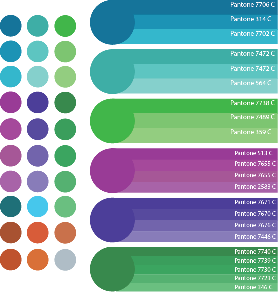
  • To meaningfully contribute to local, national and international communities in which we trade, by adopting a code of conduct which ensures care, honesty, fairness and respect.
  • To passionately campaign for the protection of the environment, human and civil rights and against animal testing within the cosmetics and toiletries industry.
  • To tirelessly work to narrow the gap between principle and practice, whilst making fun, passion and care part of our daily lives.
  • Underpinning the Mission Statement is a Trading Charter which addresses the three principal ethical concerns of The Body Shop.”

The motifs they seem to be giving off are organic, eco-friendly, community conscious. These are good aspects for a company to include in a public image because it shows they care about sustainable resources and supporting their suppliers & the environment, it lets people know the products don’t have a negative impact on the earth. That’s an image that may apply to & help Bronagh’s branding as an all-natural soap making company, so I’ll keep this I mind for the later.

Body-Mists-Group-HR_INBMSRS001-1024x619


Secondary & Primary Research

Secondary

I did an initial google search for the type of packaging I like (vintage cake boxes) and, considering the kind of products I’d be looking to market, some vintage soap packaging, this is what I found:

I also looked for colour schemes and inspiration from other logos (general/popular logos, soap/cosmetics related logos and iconic Irish logos:


These logos…

Primary

Harrods

Most of my Primary packaging research came from our trip to Harrods. I didn’t have much time to explore so I primarily looked through their food/pastry, sweet & chocolate areas and looked over their variety & quality of packaging.

Streets of London

While walking between locations I snapped a few pictures of shops & buildings that interested me. For some it was logos (or how they were displayed), others it was architecture but mostly for colour or combinations of colours.

Art Style: Celtic Knots

Celtic Art & Knots have a long & complicated history that involves many other cultures & goes through many developments in style as the art of these other cultures influence it & vice versa. The very beginning of the Celtic culture is largely unknown but a lot of their stone-carved art is preserved and their early influences from nature are clear as it ties into early Celtic religion & spirituality.

Celtic Knot Art spread & influenced art in places like the Roman Empire, northern Italy & Southern. A basic timeline for Celtic Knots (& the cultures that influenced it & the styles development) goes like this: Halstatt (central Europe, 8th-6th Century BC, straight lines), La Tene (Switzerland, 5th-4th Century BC, flowing curved lines), Roman Influence (1st Century AD Roman influenc in Celtic art & vice versa), Viking Influence (Scandinavian influence in detail, 11th Century), Golden Age (9th-12th Century AD).

Celtic Knots are known for having no clear beginning or end, sometimes representing eternity or a never ending loop, drawing in the viewer with the repeating pattern. Celtic art rarely features human figures, especially compared to other religious/Christian art that often depicts the Virgin Mary or Jesus Christ on the cross or at the Last Supper. Celtic (religious) art is more symbolic in nature with ornate crosses or 3-pointed-symbols such as the trinity knot or Spirals to represent to the Father, Son & Holy Spirit.

Celtic Knots are often recognisable in the modern world due to their use as ornamentation in Christian monuments and manuscripts such as the Book of Kells, which is widely considered a great source of Celtic Knot imagery & inspired designs, written some time during the 8th century in a Columban monastery in Ireland and is considered a national treasure. Here are some of the most well-known ones and their perceived meanings:

  • The Trinity Knot– also known as the Triquetera Knot, it is amongst the most well-known & commonly found celtic knots, often appearing jewellery. A religious meaning for this knot could be it symbolising the holy trinity of the Father, Son & Holy Spirit (in reference to its name), however it could symbolise a number of important 3’s such as past, present & future, body, mind & spirit, Creator, Destroyer & Sustainer/Creation, Preservation & Destruction, Power, Intellect, Love, etc. A similar Knot with similar possible meanings is the Spiral Knot.

Coa_Illustration_Cross_Triquetra

  • Dara Knot– The name Dara comes from the word “doire,” which is the Irish/Gaelic word for “oak tree”, which suggests the knot may symbolise the roots of an oak tree and thus the meaning may be connected as well. The most widely believed meaning is that the knot symbolises inner fortitude or resources such as inner strength, wisdom, endurance, power, stability, etc. especially during times or struggle or challenge as these qualities often stay hidden beneath the surface (much like roots beneath the soil).

dara-celtic-knot

  • Sailor’s Knot– believed to have originated from Celtic sailors by weaving 2 pieces of rope together while they spent months away at sea & far from their loved ones, the knot is said to represent friendship, love, harmony & affection.

celtic-sailors-knot

  • Celtic Cross– The Celtic cross predates Christianity and was originally given meaning by the Pagans, who believed it symbolised the 4 cardinal directions &/or the 4 elements (seeing as the 4 points of the cross divide the circle behind it into 4 sections). However, when it was adopted by the Christians they believed it was another interpretation of the holy cross (the crucifixion of Christ) & represented the Father, Son & Holy Spirit.

Celtic-Cross-4-Optimized

  • Claddagh– While technically not a Celtic knot it is an iconic & regularly used symbol in Ireland. The heart represents love, the hands represent friendship and the crown represents loyalty.

Claddagh ring

Celtic knots & symbols are a common occurrence in Ireland as a popular & some would say patriotic design choice and can often be found in everyday life, for example wedding rings/jewellery, tattoos, decorations, home décor, headstones, clothes/accessories, advertisements etc. and, while they may have originated elsewhere, over the centuries have been strongly adopted by the Irish culture.

The woven, looping style inspired by the original Celtic Knots is still used today to create new images & artworks which is why I think it would be a good idea to use one in Bronagh’s branding to show where the company originated when advertising in other countries and to evoke a feeling of home & patriotism in Irish customers.

One design I may bring into Bronagh’s branding is the sailors knot, perhaps in its packaging, lanyards &/or letter heads.

Visual Analysis

William Morris 2

Info: ‘Morris Seaweed’ was created by J.H. Dearle in 1901 under Morris & Co. created by William Morris and now exists in the Morris & Co. archive III.

Influenced by Art Nouveau, a popular art style of the time with the dark lines around the different shapes and the use of bright colours.

Repetition can be seen in the image in the set of 3 flowers in the bottom right paralleled with the 3 in the top left, this repetition helps to maintain a balance & consistency that is needed when creating patterns for printing (onto things like curtain, table cloths, packaging paper, etc.).

I noticed how the blue flowers stand out against the shades greens & earthier colours and immediately draws your eyes to it. In Ireland the colour green is very prevalent as it is featured on the Irish flag and a lot of Ireland is still countryside with grass fields and untouched woodland, so by making my design blue or bluey-green it will stand out against other Irish advertisements but won’t be so much of a departure that it won’t relate back to its Irish roots when the company expands to other parts of the UK. Blue and green are both cool, calm colours and complement each other nicely, so seeing blue amongst a background of green (or vice versa) wouldn’t be an eyesore or clash.

The image itself is very busy, with lots of small details (such as the small red & tan spots on the dark blue background) but the way it is drawn is simple in the way of the lines of darker shades to outline & show where the light would bounce off the (larger) leaves and flowers rather than gradual shading (although the simplicity means it misses out a bit on texture). However the busyness of the piece helps tie it all together (especially when tessellated), because one aspect of the piece leads to another, leads to another, etc. so all the pieces connect to create the overall complete unified image. This gives it the feeling of growing and progressively moving forward & getting bigger.


Design Development

I looked up ‘Celtic knot flowers’ in google images & found these designs:

I chose the ones I found aesthetically pleasing and simple enough to draw & not over-complicate my logo.

I then traced & sketched out a few of my favorite designs and began experimenting with colour & pattern.

logo design scan 1

With the first design (above) I feel I did the most experimenting, especially with colour & how/where to apply it. I primarily experimented with purples, blues & greens as those are some of the colors I found & liked during my research and had a look at different combinations & shades. I looked at filling in the gaps in the design with more colors and found that filling it in with block colour made the logo appear bulky whereas using a simple line pattern looked nice. I also experimented with adding shading/shadows to give my logo depth & appear 3 dimensional (seen with the bottom right, small bottom left & top left). I realized trying to use more than two (or maybe 3 if the third is black or white) would be too much & over-complicate the colour scheme and make the logo appear busy rather than simple.

logo design scan 2

With my second design I had a better idea of what colours I liked & experimented more with pattern. I used shading with the top left again and decided it would only be used for the larger logo (e.g. outside the shop/on the store sign, large labels, etc.) and use a more simplified logo for everything else (especially when the logo is printed in a small size since it would miss out on detail anyway. The design itself was simple enough to recreate though it occurred to me that due to the 6 long points it may resemble a snowflake as much as it does a flower. This design is also bolder than the previous one, which is more dainty (a quality people might associate with flowers & may help further an image of delicate skin/hair care for more sensitive customers).

logo design scan 3

By the time I got to the last 3 designs I had my heart set on my blue/turquoise colour scheme but still tried a few of my other favourite colour combinations. I quite liked the 3rd design (left column) but felt a lot of the detail would be lost out on smaller printed logos & perhaps was too complex. The 4th design (middle column) I felt looked more star-like instead or floral and, when asking an indifferent party, was told it looked more like thistles which definitely not suitable for Bronagh’s brand as her products are meant to promote better bodily care & shouldn’t be represented by something that typically causes bodily harm. I just didn’t particularly like the look of the 5th design (right column), next to the other designs it looks crumpled, busy  & complicated, it also may not be interpreted as a flower so that wouldn’t be good for Bronagh’s branding.

Colours

I took samples of colour from my initial sketches (left), layed them out neatly and found the closest matching pantones for each of them (right).

Colour schemes 2

I tested out hiw my last two designs looked on all the colours in both black & white. I personally found that, against a majority of the colours, the logos looked best in white.

Logo colour tests 2


Process of making my two Final Designs in Illustrator:

Logo process 2

(potential) Fonts

I first looked for fonts on fontmeme.com (above) and while I found some good ones I decided to keep my options open and keep looking, bringing me to dafont.com (below).

Fonts 2

A problem I found with a lot of Celtic themed fonts was the ‘g’ can often be hard to interpret on its own as well as in a word if you are unfamilial with the word (or in this case the name, Bronagh). It was important that the font was legible but also matched the rest of the branding.

Final Designs

Logo

I chose this flower design because it’s still interpretable as a flower from a distance or when printed small, which is useful when using small containers & for the sign displayed outside of the shop.

Typeface

Fonts 2I chose the font Tintoretto because it if legible, unique and keeps on theme for the Bronagh Brand.
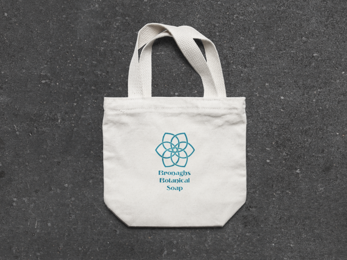
colors

Colour schemes 2

I mentioned in my Visual Analysis that green is a very common Irish colour, including in advertisment. In order to stand out amoungst other Irish brands I wanted to use a colour other than green but I also didn’t want to use anything drastically different that could potencially clash against everything around it or be an eyesore so I decided on a blue & turquoise-like combination in order to stand out in an aesthetically pleasing way.

Branding

Bronaghs Small Canvas Tote Bag MockUp 2

Tote Bag.

Bronaghs SOAP Packaging mockup

Soap Bar Box.

Bronaghs Glass Bottle Mockup - Anthony Boyd

Bubble Bath Bottle.

Bronaghs Gift-Wrap-Box-Mockup 1

Gift Packaging.

Evaluations

I started by researching the definition of ‘corporate identity’ and ‘branding’ and after grasping the meaning I started brainstorming using a mind map, which I feel gave me a lot of options to explore and a basis for what I needed to do to create a corporate identity myself.

My primary research was helpful, but to a lesser degree than my secondary research. The best of my primary research came from Harrods, taking pictures of the sections I had the chance to explore during our 1 day trip, however while I find cake/sweet packaging aesthetically pleasing and can occasionally overlap with soap packaging I found more specific sources were needed & more useful.

My secondary research was very useful and definitely played a large part in my final designs. I’ll admit that the involvement of Celtic Knots was a result of growing up with similar imagery & having a respect & fondness for it. However both it and the floral imagery are both appropriate for the context of Bronaghs as Celtic Knots are iconic Irish imagery and flowers tie into the ‘botanical’, natural aspects of the company and are associated with good scents, as is soap (as I found that floral patterns were sometimes used in soap packaging).

I quite happy with my experimental sketches, I feel like I explored a range of designs, patterns and colour schemes and, while it would have perhaps been better to come up with some self-created designs, Celtic Knots are known for their difficulty & complexity and I didn’t want to risk using up too much time trying to create a unique Celtic knot flower design from scratch, especially when there are a lot of (possibly well-known) designs that have yet to be used in anyone else’s branding.

I think my reasoning for Bronaghs final colour scheme is logical and well-explained, as I wanted the logo to stand out but for the right reasons.

I feel as though my skill with Adobe Illustrator has definitely improved since our last project and I have also learned the basic method for using mock-ups in photoshop. While I am still more confident drawing by hand I do feel more comfortable using these computer programs than I was before, though I will continue to practice and use both methods in future.

I feel as though I could have organised my blog a little differently, though overall I feel like you can see my process from initial context to final pieces fairly well throughout.

I planned to use my time more effectively but a few things took away more time than expected from my project, though I feel like I’m progressively getting a better at managing my time.

Overall, I’m happy with my final pieces, although I had more complicated ideas in mind I’m glad I learned the skills I did this project so maybe I can make more complex final pieces for future units.

Harvard References

Unit 5 links3


Unit 12.1: Logo Design

Definition of logo:

“Also called logotype. a graphic representation or symbol of a company name, trademark, abbreviation, etc., often uniquely designed for ready recognition.” – http://www.dictionary.com/browse/logo

A Logo may be a word, letter or symbol and is incredibly important to a organisations branding as it is its’ identifier to the general public & will be branded on its product, uniforms, transport vehicles, etc. and can therefore effect the overall image of the organisation and how they are recieved by the public, making them essential.

Below there are two mind maps that we made as a group while discussing what the words ‘logo‘ and ‘branding‘ means to us:

img_0840.jpg

img_0839.jpg


Screen Shot 2017-09-27 at 14.34.49

I did soem research on the development of various different brands & kinds of products.organisations and took inspiration from them.

Research

Pepsi History & Past Logo’s

Pepsi as created in 1898 and was originally named ‘Brad’s Drink’ after creator Caleb Bradham. In an effort to gain a more widespread audience ‘Brad’s Drink’ was renamed after the two main ingredients:  Pepsin (a digestive enzyme) and kola nuts to create Pepsi Cola (they later removed the ‘Cola’ from the end of their name/logo to differentiate themselves from their competitor Coca Cola.).

It is debated whether the creator Caleb Bradham designed the original logo or whether it was  Bayard Wootten, one of the South’s best-known female photographers of the early 20th century & Bradham’s neighbour at the time and that she merely wasn’t credited (as was the case for many women of various fields at the time). Bradham supposedly scribbled a logo design for the company’s first corporate identity and later released a redesign in 1905 after his business had grown.  During World War II Pepsi decided to show support & patriotism to The United States by brandishing the American colours (red, white and blue) on their products while also further distinguishing themselves from Coke who, at that point, only had the black font and no colour in their logo.

Pepsi’s latest logo redesign was by the New York-based Arnell Group for $1 million, to which they faced criticism from both the press and customers. The new design reportedly includes a “smile”, along with the use of a less formal rounded lowercase font.

pepsi-logo-evolution

The first design in 1898 is cursive & intricate, quirky but in-style for the time period, the designs of the later typefaces are still cursive but bolder & more legible. 1950, with the introduction of the bottle cap, was the first logo to be a symbol as oppose to just typeface of the products name and the bottle cap design continued (developing into a more Mod Style in ’62) until 1973, however they kept the circular shape which the logo has now become iconic. In 2004 the design became more complicated with the detailed graphics but besides that the design had remained fairly simple to this day with the minimalist design and simple use of font & colour.

Competitors

The history of Pepsi often parallels or crosses over with the histories of Coca Cola & Dr Pepper

Coca Cola was invented by Dr John S Pemberton in May of 1886 and their first official logo came the year after. The Coca Cola logo is now one of the most well-known, globally-recognised brands of the modern world with a very consistent logo likely aiding them in their success & notoriety as it is easily recognised regardless generation or background. The logo is even recognisable in different colours as they keep the same font but implore various colours to match to their various Coke flavours & versions.

Coca-Cola-logo-history

Charles Alderton created Dr Pepper in 1865 and it has since become one of the oldest & most iconic brands worldwide, being sold in places such as the Europe, the USA, Asia & Australia (among others) and being the oldest of the 3 competitors. However, the first recorded Dr pepper logo advertisements didn’t occur until the 1890’s. Since then the the design has gone through many changes in font & design but has stayed relatively consistent in colour scheme with it’s use of reds, pinks & other warmer colours.

dr-pepper-logos.png

The evolution of the 3 competitor’s advertisements are similar in a few ways: The beginning cursive font of the products full name, the development of the font, the later addition of now iconic colours, the logo going through the trends of the time, etc.IMG_0967

Primary/Artist research

As first-hand research I went to a supermarket & looked at the various logos for inspiration.

But I payed extra attention to the bottled & canned drinks as they were competeing in the same market as Pepsi, paying attention to any patterns in terms of typeface, colour scheme and graphics (e.g. pictures of fruit, shapes, designs, etc.)


Visual Analysis

NASA after they colonise the moon

The only colours used are various mixtures of Navy Blue & White. Blue naturally being a calming colour especially with the use of different shades and the lack of outlines instead using positive & negative space. The darker the blue the more depth it has and the lighter the blue or the closer to white it is signifies what the light is hitting and contrasting with the background, bringing emphasis to the central image.

The image has good hierarchy; the Spaceman/smaller image is supported by the moon/bigger image as well as variety of textures such as the rough, uneven texture of the moon vs the sleek texture of the lawnmower and the slight motion of the image caused by the stars flowing behind the Spaceman’s pack & the direction of the lawnmower.

Proportion: Correct proportions in regards of the Spaceman’s anatomy in relation to the lawnmower, however not the correct scale in relation to the moon (& the Spaceman).

The image is minimalist (the only complex part of the image is the texture of the moon) & I want to incorporate that into my work.

I want minimalism in my logo for 2 reasons:

  1. Aesthetic trends- the general aesthetic of a culture/society can vary from decade to decade (e.g. Art deco in the 1920’s, Mod Style in the 1960’s, the bold & bright colours of the 1980’s, etc.), some trends are even resurrected such as the minimalist style of the 1990’s (often seen as a direct reaction/departure from the 80’s, sometimes referred to a ‘back-to-basics’) with the resurgence of 90’s Grunge fashion such as chokers, sheer clothing & Doc Martins.
  2. Efficiency simple shapes & colouring is easier to remember, scale & replicate than complex images with a mixture of colours & shading. Printing the logo on their products, uniforms, vehicles, etc. is simplified & the image becomes more recognisable because they don’t have to memorise tedious details


Preliminary Sketches & Development

IMG_0973

Near the beginning of the project I decided to brainstorm ideas after seeing the evolution of Pepsi’s logo but prior to completing my research entirely but I later developed these ideas further while also coming up with new ones using the research I did these initial sketches. This is where my initial ‘bubbles’ idea came from, the bubbles signifying the fizz in Pepsi, a key aspect in the drink & often its’ allure as a soft drink.

Screen Shot 2017-09-29 at 12.10.15

Screen Shot 2017-09-29 at 12.11.05

I wanted to keep the traditional Red, White & Blue due to its iconic attachment to Pepsi itself & it’s tie-ins to Pepsi’s history during WWII where they dawned the American colours as a sign of Patriotism, so experimented exclusively with those colours (+black to outline) with the coloured pens I had on hand.

I often referred back to the evolution of the existing logo with its various typefaces (e.g. the early red cursive writing) and symbols (e.g. the bottle cap).

Screen Shot 2017-09-29 at 12.33.35

I experimented with various fonts & combinations or white, black & blue on Word, Baushaus 93 proving to be closest to the font I was looking for but deciding on this one for one of my two final designs:

Circular font

I also googled ‘circular font’ and found this, unfortunately couldn’t find a name or creator for it. I chose this font because the style is quite futuristic & sci-fi and would likely be received well by teenagers & young adults that make up a considerable amount of the target audience as well as being heavily curved and would go well with the roundness of the bubbles I want to include in the logo.


Final designs

B and W design 2

Above text: “I had the idea for including bubbles to relate to the fizziness of the drink so in order for the word to better match. I looked up ‘circular font/ and found the one above. I added a few more of the smallest bubbles to this one then there was on the original. To put this in illustrator I’ll either find the original font & put it in or scan it in & pentool around it”

B and W design 1

It came down to 2 designs which I redrew larger and more accurate. For the first (Design A) I used the Circular Font I found on Google, the second (Design B) I drew myself but was influenced by Pepsi’s current typeface with the all-lower-case, rounded shape but added the extra bubble shapes above & below the ‘e’ and as the dots on the ‘i’ to tie-in to my bubble theme as well as rounding off the ‘e’ and the tails on the ‘s’ to make it better resemble two circles.

Then I experimented with colour, ultimately deciding to go for red type on a blue background as the blue-on-red looked to harsh on the eyes and too closely resembled Coca Cola. I also decided to include the white circles in & around the type to make the ‘bubbles’ more clear & noticeable.

Final stages of design

I ultimately chose to move forward with Design B as my Final Design. I scanned my Final design onto my memory stick in order to move it into Adobe Illustrator began to pentool around it, correcting angles, straightening lines and tidying things up as I went along.

For the bubbles & ‘p’s I used the circle making tool to create the inner & outer circles and for the ‘p’ I used the pentool to create straight & curved lines to create the tail. For the others (‘e’,’s’ & ‘i’) I used the same pentool & curved/straight lines. After that I took a sample of the blue & red shades used in the current Pepsi logo to use in mine.

Final Design 1-01

The reason I decided on Design B after getting a few others for their opinions on my last two designs and because I feel like it’s the better execution of my bubble idea out of the two as it incorporates the bubbles into all the letters individually. The reason I like the bubble idea so much is that it ties-into the fizziness of the drink itself and that’s a majority of the appeal of Pepsi, quite similarly to how during the time before dietary health was better developed most people believed that soft drinks such as Pepsi, Coka Cola & Dr Pepper were good for you & they often incorporated this ‘health aspect’ into their marketing.

The font in my final design, as mentioned before, is quite similar to the current font used by Pepsi (something I realised part-way through the later development) and consistency very often plays a part in a products recognisability & popularity, as if a products’ branding is drastically changed their target audience &/or their regular consumers may no longer immediately recognise the product in the shops anymore and they may face some loses in sales, especially if the new design is not well received.

The font itself is fairly simple & easily understandable, even from a distance which is important for a logo, and isn’t harsh on the eyes.

I wanted to keep the colours red, white & blue as a way to both stay consistent with the iconic Pepsi colours that they adopted to show patriotism during the second World War, maintaining some of Pepsi’s historical highlights. I used the white circles to signify the bubbles so they stood out amoungst the red & blue so the bubbles would be more perceptible as bubbles.


Evaluation/Conclusion

I did both Primary & Secondary research for this project and I believe my sources were both suitable & reliable (my primary research being at a local, well-known supermarket chain, and my secondary research from various sources online, many of which were from official info. sources by the companies of the products I was researching), although I believe I used my secondary research more, simply because it interested me more than some of my primary research did.

I believe my sketches and final designs were good and fitting for the context. I explored various ideas and took inspiration from my research (especially into the histories of certain brand logo’s).

I’m happy with my choice of typeface, because it is easily read, it’s appropriate for the product and the theme, however it can also be argued it’s a little less stylish then it could be as different kinds of fonts are more popular amoung young people today (e.g. cursive or geometic fonts), but ultimately it was a good decision for the context of the product & project.

I know the layout of my blog could use some work, there did occasionally come times when I didn’t know where to put certain pieces or work & so they seem out-of-place, or it feels like something is missing form a section but I’m unsure what, which is something that can be helped by making a list of things I need in my blog & in what order (a technique I plan to use in future).

I don’t see anything inappropriate about my research, development or final design, I think I ended up with a relatively universal design that can be enjoyed by people of diverse backgrounds, identities and ages.

While I do believe my technique with Adobe Illustrator could use some considerable work in order to get more comfortable with the program I think I did well considering my lack of experience. I asked for help when I got stuck and did my best to listen to it and try to remember the various tricks I was taught during this first project.

Considering this is my first project in a fairly unfamiliar field I feel as though I’ve done well and that I’ve developed a better understanding of the course and new skills I can continue to improve upon such as my skills in Illustrator and the organisation & use of my time.

Harvard References