What is Corporate Identity?
I began by brainstorming what exactly Corporate Identity means and what would be included in making one. I started with creating the mind map below:

I concluded that a Corporate Identity consisted of various different things working together to create the overall image that the corporation is question wishes to put forward to the public (including customers, the media, other business, etc.) and distinguishes itself from other companies (especially those who perform a similar function, e.g. soft drinks, soap, clothes, etc.).
An important aspect of a Corporate Identity is it’s branding, which is the specific images, fonts, words, colours, etc. that is unique to that company such as a logo or slogan.
Company Context
Bronagh’s Botanical Soap is an Ireland-based, family-run company founded by Bronagh Murphy in 2015 that produces hand-made soaps, hair care & skin care products.
After almost 3 years of production Bronagh is now looking for a corporate identity to start advertising her brand to a wider audience in other parts of the UK, such as England, Scotland & Wales.
Competitor Research
LUSH:
![]()
LUSH was founded by herbal trichologist Mark Constantine and beauty therapist Liz Weir in 1995 in Poole where their headquarters is still placed. The name ‘LUSH’ was chosen by the company after a competition was held for customers to suggest a new company name. The history of LUSH involves their older competitor The Body Shop in the early 1980’s when the founder, Anita Roddick hired Constantine & Weir as suppliers for TBS, providing original recipes for bath & beauty goods. The Body shop later purchased the rights & formulas for Constantine & Weir’s recipes for £11 million.
After selling their formulas Weir & Constantine created Cosmetics-To-Go, a mail order cosmetics company where they started working with Mo Constantine, Rowena Bird, Helen Ambrosen, and Paul Greaves, people they would continue to work with in the creation of LUSH.
LUSH produces bath bombs, soaps, shaving gels, shampoo bars, make-up, face cleansers and perfumes, all of them suitable for vegetarians made from natural ingredients such as fruits, vegetables, flowers and oils, however about 1/5 of them include things like eggs, milk, honey & lanolin making those products unsuitable for vegans. LUSH goods are also all handmade, packaged with recyclable materials and are given stickers specifying who & when the product was made and when it should be used before along with being “very dedicated to fighting animal testing”.
On LUSH’s ‘we believe’ statement/article, they claim:
“We believe…
- We believe in making effective products from fresh organic* fruit and vegetables, the finest essential oils and safe synthetics.
- We believe in buying ingredients only from companies that do not commission tests on animals and in testing our products on humans.
- We invent our own products and fragrances. We make them fresh* by hand using little or no preservative or packaging, using only vegetarian ingredients and tell you when they were made.
- We believe in happy people making happy soap, putting our faces on our products and making our mums proud.
- We believe in long candlelit baths, sharing showers, massage, filling the world with perfume and the right to make mistakes, lose everything and start again.
- We believe our products are good value, that we should make a profit and that the customer is always right.
- We believe that all people should enjoy freedom of movement across the world.
- *We also believe words like “fresh” and “organic” have an honest meaning beyond marketing.”
They clearly want to put forth the image of being family-friendly/appropriate for anyone, using non-harmful materials & methods, being environmental & animal friendly and that the products you buy from them are good quality & were made with care.
This kind of image is one I want to take influence from when marketing Bronagh’s, as it can attract a wide range of customers and suites the company’s background. I want people to associate Bronagh’s with well-made, hand-made, products made with natural materials and by people who care about making quality products in the best way they can the same way Lush does.

The Body Shop:
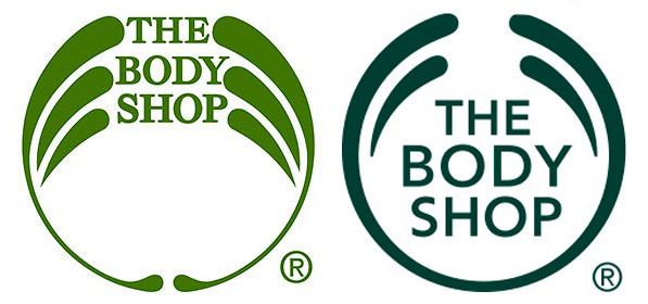
The Body Shop was founded in the UK in 1976 by Dame Anita Roddick, the first of which opened in Brighton. Over 40 years later The Body Shop now employs over 22,ooo people in 3,000 shops that exist in 66 different countries selling perfume, cosmetics and skin care products made suitable for vegetarians and without the use of animal testing. They also believe in treating their suppliers fairly and help their communities flourish through their Enrich Not Exploit™ Commitment and Community Trade programme. Between March 2006 – June 2017 The Body Shop was owned by French cosmetics company L’Oréal but came under the ownership of a Brazilian cosmetics company called Natura for a purchase of around £880 million.
The Body Shop is a provider of cosmetics, hair care products, soap/shower gels, skin care products (e.g. body scrubs, body butters and bath lilies), perfumes/colognes, etc. all of which made using natural products.
“The Body Shop Mission Statement:
- To dedicate our business to the pursuit of social and environmental change.
- To creatively balance the financial and human needs of our stakeholders employees, franchisees, customers, suppliers and shareholders.
- To courageously ensure that our business is ecologically sustainable, meeting the needs of the present without compromising the future.
- To meaningfully contribute to local, national and international communities in which we trade, by adopting a code of conduct which ensures care, honesty, fairness and respect.
- To passionately campaign for the protection of the environment, human and civil rights and against animal testing within the cosmetics and toiletries industry.
- To tirelessly work to narrow the gap between principle and practice, whilst making fun, passion and care part of our daily lives.
- Underpinning the Mission Statement is a Trading Charter which addresses the three principal ethical concerns of The Body Shop.”
The motifs they seem to be giving off are organic, eco-friendly, community conscious. These are good aspects for a company to include in a public image because it shows they care about sustainable resources and supporting their suppliers & the environment, it lets people know the products don’t have a negative impact on the earth. That’s an image that may apply to & help Bronagh’s branding as an all-natural soap making company, so I’ll keep this I mind for the later.

Secondary & Primary Research
Secondary
I did an initial google search for the type of packaging I like (vintage cake boxes) and, considering the kind of products I’d be looking to market, some vintage soap packaging, this is what I found:


I also looked for colour schemes and inspiration from other logos (general/popular logos, soap/cosmetics related logos and iconic Irish logos:


")


These logos…
Primary
Harrods


Most of my Primary packaging research came from our trip to Harrods. I didn’t have much time to explore so I primarily looked through their food/pastry, sweet & chocolate areas and looked over their variety & quality of packaging.
Streets of London


While walking between locations I snapped a few pictures of shops & buildings that interested me. For some it was logos (or how they were displayed), others it was architecture but mostly for colour or combinations of colours.
Art Style: Celtic Knots
Celtic Art & Knots have a long & complicated history that involves many other cultures & goes through many developments in style as the art of these other cultures influence it & vice versa. The very beginning of the Celtic culture is largely unknown but a lot of their stone-carved art is preserved and their early influences from nature are clear as it ties into early Celtic religion & spirituality.
Celtic Knot Art spread & influenced art in places like the Roman Empire, northern Italy & Southern. A basic timeline for Celtic Knots (& the cultures that influenced it & the styles development) goes like this: Halstatt (central Europe, 8th-6th Century BC, straight lines), La Tene (Switzerland, 5th-4th Century BC, flowing curved lines), Roman Influence (1st Century AD Roman influenc in Celtic art & vice versa), Viking Influence (Scandinavian influence in detail, 11th Century), Golden Age (9th-12th Century AD).
Celtic Knots are known for having no clear beginning or end, sometimes representing eternity or a never ending loop, drawing in the viewer with the repeating pattern. Celtic art rarely features human figures, especially compared to other religious/Christian art that often depicts the Virgin Mary or Jesus Christ on the cross or at the Last Supper. Celtic (religious) art is more symbolic in nature with ornate crosses or 3-pointed-symbols such as the trinity knot or Spirals to represent to the Father, Son & Holy Spirit.
Celtic Knots are often recognisable in the modern world due to their use as ornamentation in Christian monuments and manuscripts such as the Book of Kells, which is widely considered a great source of Celtic Knot imagery & inspired designs, written some time during the 8th century in a Columban monastery in Ireland and is considered a national treasure. Here are some of the most well-known ones and their perceived meanings:
- The Trinity Knot– also known as the Triquetera Knot, it is amongst the most well-known & commonly found celtic knots, often appearing jewellery. A religious meaning for this knot could be it symbolising the holy trinity of the Father, Son & Holy Spirit (in reference to its name), however it could symbolise a number of important 3’s such as past, present & future, body, mind & spirit, Creator, Destroyer & Sustainer/Creation, Preservation & Destruction, Power, Intellect, Love, etc. A similar Knot with similar possible meanings is the Spiral Knot.

- Dara Knot– The name Dara comes from the word “doire,” which is the Irish/Gaelic word for “oak tree”, which suggests the knot may symbolise the roots of an oak tree and thus the meaning may be connected as well. The most widely believed meaning is that the knot symbolises inner fortitude or resources such as inner strength, wisdom, endurance, power, stability, etc. especially during times or struggle or challenge as these qualities often stay hidden beneath the surface (much like roots beneath the soil).

- Sailor’s Knot– believed to have originated from Celtic sailors by weaving 2 pieces of rope together while they spent months away at sea & far from their loved ones, the knot is said to represent friendship, love, harmony & affection.
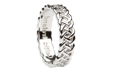
- Celtic Cross– The Celtic cross predates Christianity and was originally given meaning by the Pagans, who believed it symbolised the 4 cardinal directions &/or the 4 elements (seeing as the 4 points of the cross divide the circle behind it into 4 sections). However, when it was adopted by the Christians they believed it was another interpretation of the holy cross (the crucifixion of Christ) & represented the Father, Son & Holy Spirit.

- Claddagh– While technically not a Celtic knot it is an iconic & regularly used symbol in Ireland. The heart represents love, the hands represent friendship and the crown represents loyalty.

Celtic knots & symbols are a common occurrence in Ireland as a popular & some would say patriotic design choice and can often be found in everyday life, for example wedding rings/jewellery, tattoos, decorations, home décor, headstones, clothes/accessories, advertisements etc. and, while they may have originated elsewhere, over the centuries have been strongly adopted by the Irish culture.
The woven, looping style inspired by the original Celtic Knots is still used today to create new images & artworks which is why I think it would be a good idea to use one in Bronagh’s branding to show where the company originated when advertising in other countries and to evoke a feeling of home & patriotism in Irish customers.
One design I may bring into Bronagh’s branding is the sailors knot, perhaps in its packaging, lanyards &/or letter heads.
Visual Analysis
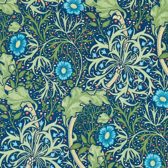
Info: ‘Morris Seaweed’ was created by J.H. Dearle in 1901 under Morris & Co. created by William Morris and now exists in the Morris & Co. archive III.
Influenced by Art Nouveau, a popular art style of the time with the dark lines around the different shapes and the use of bright colours.
Repetition can be seen in the image in the set of 3 flowers in the bottom right paralleled with the 3 in the top left, this repetition helps to maintain a balance & consistency that is needed when creating patterns for printing (onto things like curtain, table cloths, packaging paper, etc.).
I noticed how the blue flowers stand out against the shades greens & earthier colours and immediately draws your eyes to it. In Ireland the colour green is very prevalent as it is featured on the Irish flag and a lot of Ireland is still countryside with grass fields and untouched woodland, so by making my design blue or bluey-green it will stand out against other Irish advertisements but won’t be so much of a departure that it won’t relate back to its Irish roots when the company expands to other parts of the UK. Blue and green are both cool, calm colours and complement each other nicely, so seeing blue amongst a background of green (or vice versa) wouldn’t be an eyesore or clash.
The image itself is very busy, with lots of small details (such as the small red & tan spots on the dark blue background) but the way it is drawn is simple in the way of the lines of darker shades to outline & show where the light would bounce off the (larger) leaves and flowers rather than gradual shading (although the simplicity means it misses out a bit on texture). However the busyness of the piece helps tie it all together (especially when tessellated), because one aspect of the piece leads to another, leads to another, etc. so all the pieces connect to create the overall complete unified image. This gives it the feeling of growing and progressively moving forward & getting bigger.
Design Development
I looked up ‘Celtic knot flowers’ in google images & found these designs:


I chose the ones I found aesthetically pleasing and simple enough to draw & not over-complicate my logo.
I then traced & sketched out a few of my favorite designs and began experimenting with colour & pattern.
![]()
With the first design (above) I feel I did the most experimenting, especially with colour & how/where to apply it. I primarily experimented with purples, blues & greens as those are some of the colors I found & liked during my research and had a look at different combinations & shades. I looked at filling in the gaps in the design with more colors and found that filling it in with block colour made the logo appear bulky whereas using a simple line pattern looked nice. I also experimented with adding shading/shadows to give my logo depth & appear 3 dimensional (seen with the bottom right, small bottom left & top left). I realized trying to use more than two (or maybe 3 if the third is black or white) would be too much & over-complicate the colour scheme and make the logo appear busy rather than simple.
![]()
With my second design I had a better idea of what colours I liked & experimented more with pattern. I used shading with the top left again and decided it would only be used for the larger logo (e.g. outside the shop/on the store sign, large labels, etc.) and use a more simplified logo for everything else (especially when the logo is printed in a small size since it would miss out on detail anyway. The design itself was simple enough to recreate though it occurred to me that due to the 6 long points it may resemble a snowflake as much as it does a flower. This design is also bolder than the previous one, which is more dainty (a quality people might associate with flowers & may help further an image of delicate skin/hair care for more sensitive customers).
![]()
By the time I got to the last 3 designs I had my heart set on my blue/turquoise colour scheme but still tried a few of my other favourite colour combinations. I quite liked the 3rd design (left column) but felt a lot of the detail would be lost out on smaller printed logos & perhaps was too complex. The 4th design (middle column) I felt looked more star-like instead or floral and, when asking an indifferent party, was told it looked more like thistles which definitely not suitable for Bronagh’s brand as her products are meant to promote better bodily care & shouldn’t be represented by something that typically causes bodily harm. I just didn’t particularly like the look of the 5th design (right column), next to the other designs it looks crumpled, busy & complicated, it also may not be interpreted as a flower so that wouldn’t be good for Bronagh’s branding.
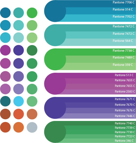
Colours
I took samples of colour from my initial sketches (left), layed them out neatly and found the closest matching pantones for each of them (right).
I tested out hiw my last two designs looked on all the colours in both black & white. I personally found that, against a majority of the colours, the logos looked best in white.
![]()
Process of making my two Final Designs in Illustrator:
![]()
(potential) Fonts
I first looked for fonts on fontmeme.com (above) and while I found some good ones I decided to keep my options open and keep looking, bringing me to dafont.com (below).

A problem I found with a lot of Celtic themed fonts was the ‘g’ can often be hard to interpret on its own as well as in a word if you are unfamilial with the word (or in this case the name, Bronagh). It was important that the font was legible but also matched the rest of the branding.
Final Designs
Logo
I chose this flower design because it’s still interpretable as a flower from a distance or when printed small, which is useful when using small containers & for the sign displayed outside of the shop.
Typeface
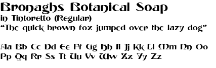 I chose the font Tintoretto because it if legible, unique and keeps on theme for the Bronagh Brand.
colors
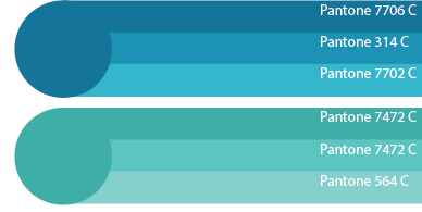
I mentioned in my Visual Analysis that green is a very common Irish colour, including in advertisment. In order to stand out amoungst other Irish brands I wanted to use a colour other than green but I also didn’t want to use anything drastically different that could potencially clash against everything around it or be an eyesore so I decided on a blue & turquoise-like combination in order to stand out in an aesthetically pleasing way.
Branding
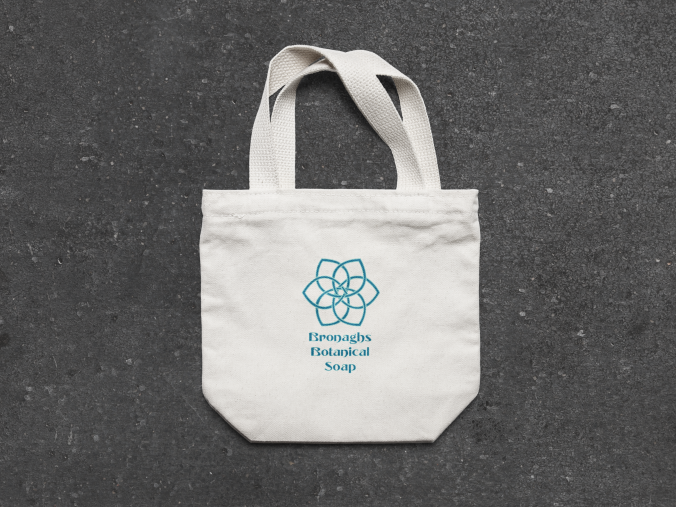
Tote Bag.
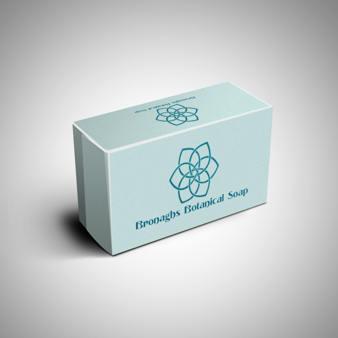
Soap Bar Box.
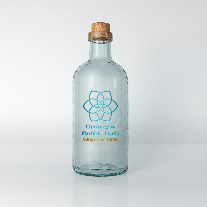
Bubble Bath Bottle.
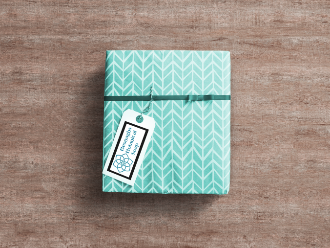
Gift Packaging.
Evaluations
I started by researching the definition of ‘corporate identity’ and ‘branding’ and after grasping the meaning I started brainstorming using a mind map, which I feel gave me a lot of options to explore and a basis for what I needed to do to create a corporate identity myself.
My primary research was helpful, but to a lesser degree than my secondary research. The best of my primary research came from Harrods, taking pictures of the sections I had the chance to explore during our 1 day trip, however while I find cake/sweet packaging aesthetically pleasing and can occasionally overlap with soap packaging I found more specific sources were needed & more useful.
My secondary research was very useful and definitely played a large part in my final designs. I’ll admit that the involvement of Celtic Knots was a result of growing up with similar imagery & having a respect & fondness for it. However both it and the floral imagery are both appropriate for the context of Bronaghs as Celtic Knots are iconic Irish imagery and flowers tie into the ‘botanical’, natural aspects of the company and are associated with good scents, as is soap (as I found that floral patterns were sometimes used in soap packaging).
I quite happy with my experimental sketches, I feel like I explored a range of designs, patterns and colour schemes and, while it would have perhaps been better to come up with some self-created designs, Celtic Knots are known for their difficulty & complexity and I didn’t want to risk using up too much time trying to create a unique Celtic knot flower design from scratch, especially when there are a lot of (possibly well-known) designs that have yet to be used in anyone else’s branding.
I think my reasoning for Bronaghs final colour scheme is logical and well-explained, as I wanted the logo to stand out but for the right reasons.
I feel as though my skill with Adobe Illustrator has definitely improved since our last project and I have also learned the basic method for using mock-ups in photoshop. While I am still more confident drawing by hand I do feel more comfortable using these computer programs than I was before, though I will continue to practice and use both methods in future.
I feel as though I could have organised my blog a little differently, though overall I feel like you can see my process from initial context to final pieces fairly well throughout.
I planned to use my time more effectively but a few things took away more time than expected from my project, though I feel like I’m progressively getting a better at managing my time.
Overall, I’m happy with my final pieces, although I had more complicated ideas in mind I’m glad I learned the skills I did this project so maybe I can make more complex final pieces for future units.
Harvard References
